The Timeseries Graph
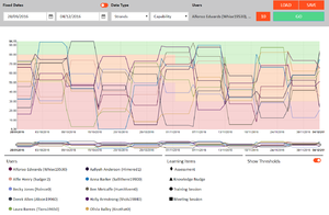
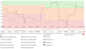
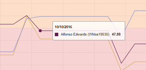
The timeseries graph shows the scores of the users selected, with their colors represented in the Users legend below it and learning items shown on the line, with the shapes corresponding to the Learning Items legend. The threshold is overlaid and shows which bands were active at the times on the graph.
Users can be deselected by clicking on the round dot next to their name, so smaller selections can be compared without separate searches.
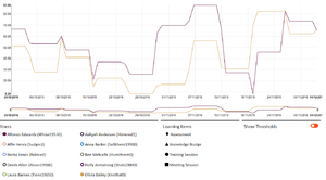
Thresholds can be toggled on or off using the “Show Thresholds” toggle under the bar.
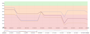
A smaller time frame can also be selected by dragging the tabs at the ends of the mini graph below the main one, allowing for zooming in to times of interest.
Hovering over the line also gives specific information on whose line it is, their score, and the date the score was taken.

