Data Visualization
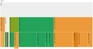
The performance data is displayed as a series of partition charts with the selected Strand at the top level. Each demographic grouping will produce its own partition chart, with the title representing what percentile range they use, if any, and the demographic selection.
Clicking on the different parts of the Strands will zoom to that node and allow deeper structures to be explored. The colors used are taken from the defined Thresholds.
The values shown are the raw scores for the current user aggregated over the selected date window.
The button in the top right-hand corner toggles whether the chart is linked to the other charts. Linked charts will keep the same focus when navigating the Strands tree structure.
This page was last edited on July 18, 2018, at 14:03.
Comments or questions about this documentation? Contact us for support!

