Contents
Branding Options
The branding settings allow customization of the look and feel of the application so that it closely aligns with company branding.
On the Branding page, four tabs enable you to define branding settings. The four tabs are as follows:
Colour Settings
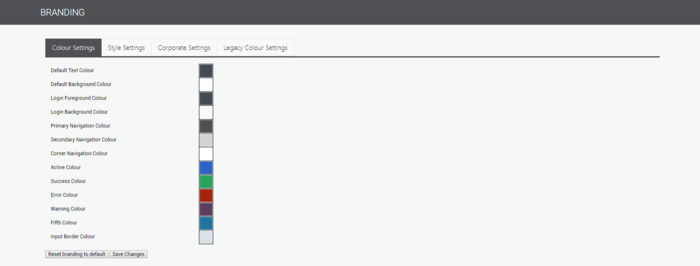
The following settings can be defined on the Colour Settings tab:
| Default Text Colour | The standard colour used for most text throughout the application. |
| Default Background Colour | Changes the colour of some grids in the application. |
| Login Foreground Colour | Changes the colour of the text displayed on the login page. |
| Login Background Colour | Changes the colour of the login box. |
| Primary Navigation Colour | Changes the colour of the menu and page headers. |
| Secondary Navigation Colour | Changes the colour of the menu sub-items. |
| Corner Navigation Colour | Changes the colour of the logo section of the menu. |
| Active Colour | Changes the colour of the currently-selected item. It is also used for most buttons. |
| Success Colour | Changes the colour of messages that indicate success, and changes the colour of some Submit buttons. |
| Error Colour | Changes the colour of messages and highlights that indicate an error, and changes the colour of some buttons, such as Revert. |
| Warning Colour | Changes the colour of messages and highlights that indicate a warning. |
| Fifth Colour | Used when additional colours are required (I.e. on screens with many buttons or status indicators). |
| Input Border Colour | Changes the colour of border around any input box. |
Style Settings
The following settings can be defined on the Style Settings tab.
| Header Font Type | Sets the font for the headings within the application. |
| Body Font Type | Sets the font for any body within the application. |
| Change Font Size | Sets the size of the text within the application. |
| Border Style | Sets the thickness of any border within the application. |
| Corner Style | Sets the corner style of the boxes and buttons within the application. |
| Button/Heading Text | Sets the button/heading text within the application. |
Corporate Settings
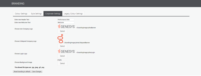
The Corporate Settings tab allows the user to specify company logos for the menu and Login screen. In addition, the user can select a background image to be displayed on the Login page.
The following settings can be defined on the Corporate Settings tab:
| Enter new Header Text | Text displayed on the login page. |
| Enter new Welcome Text | Optional text. |
| Choose new Company Logo | The logo displayed when a menu is expanded. |
| Choose Collapsed Company Logo | The logo displayed when the menu is collapsed. |
| Choose Login Logo | The logo displayed on the Login screen. |
| Choose Background Image | The background image displayed on the Login page. Note: To produce a high-quality image, the resolution must be sufficient for full-screen display. |
Legacy Colour Settings
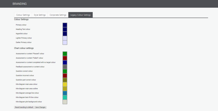
The Legacy Colour Settings tab contains a small number of colour setting options, although these will be slowly discontinued as new versions of the product are released.


