Contents
Customizable Chat Registration Form
Introduced: 9.0.000.08
WebChat allows you to customize the registration form shown to users prior to starting a session. The following form inputs are currently supported:
- Text
- Select
- Hidden
- Checkbox
- Textarea
Customization is done through an object definition that defines the layout, input type, label, and attributes for each input. You can set the default registration form definition in the _genesys.widgets.webchat.form configuration option. Alternately, you can pass a new registration form definition through the WebChat.open command:
_genesys.widgets.bus.command("WebChat.open", {formJSON: oRegFormDef});Inputs are rendered as stacked rows with one input and one optional label per row.
Default Example
The following example is the default object used to render WebChat’s registration form. This is a very simple definition that does not use many properties.
Our example below simply demonstrates how WebChat defines its default form internally.
{
	wrapper: "<table></table>",
	inputs: [

		{
			id: "cx_webchat_form_firstname",
			name: "firstname",
			maxlength: "100",
			placeholder: "@i18n:webchat.ChatFormPlaceholderFirstName",
			label: "@i18n:webchat.ChatFormFirstName"
		},

		{
			id: "cx_webchat_form_lastname",
			name: "lastname",
			maxlength: "100",
			placeholder: "@i18n:webchat.ChatFormPlaceholderLastName",
			label: "@i18n:webchat.ChatFormLastName"
		},

		{
			id: "cx_webchat_form_email",
			name: "email",
			maxlength: "100",
			placeholder: "@i18n:webchat.ChatFormPlaceholderEmail",
			label: "@i18n:webchat.ChatFormEmail"
		},

		{
			id: "cx_webchat_form_subject",
			name: "subject",
			maxlength: "100",
			placeholder: "@i18n:webchat.ChatFormPlaceholderSubject",
			label: "@i18n:webchat.ChatFormSubject"
		}
	]
}
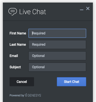
Using this definition will result in this output:
Properties
Each input definition can contain any number of properties. These are categorized in two groups: "Special Properties", which are custom properties used internally to handle rendering logic, and "HTML Attributes" which are properties that are applied directly as HTML attributes on the input element.
Special Properties
| Property | Type | Default | Description |
|---|---|---|---|
| type | string | "text" | Sets the type of input to render. Possible values are currently "text", "hidden", "select", "checkbox", and "textarea". |
| label | string | Set the text for the label. If no value provided, no label will be shown. You may use localization query strings to enable custom localization (for example, label: "@i18n:namespace.StringName"). Localization query strings allow you to use strings from any widget namespace or to create your own namespace in the localization file (i18n.json) and use strings from there (for example, label: "@i18n:myCustomNamespace.myCustomString001"). For more information, see the Labels section. | |
| wrapper | HTML string | “<table></table>" | Each input exists in its own row in the form. By default this is a table-row with the label in the left cell and the input in the right cell. You can redefine this wrapper and layout by specifying a new HTML row structure. See the Wrappers section for more info. The default wrapper for an input is " |
| validate | function | Define a validation function for the input that executes when the input loses focus (blur) or changes value. Your function must return true or false. True to indicate it passed, false to indicate it failed. If your validation fails, the form will not submit and the invalid input will be highlighted in red. See the Validation section for more details and examples. | |
| validateWhileTyping | boolean | false | Execute validation on keypress in addition to blur and change. This ignores non-character keys like shift, ctrl, and alt. |
| options | array | [] | When ‘type’ is set to ‘select’, you can populate the select by adding options to this array. Each option is an object (for example, {text: ‘Option 1’, value: ‘1’} for a selectable option, and {text: "Group 1", group: true} for an option group). |
HTML Attributes
With the exception of special properties, all properties will be added as HTML attributes on the input element. You can use standard HTML attributes or make your own.
Example
{
	id: "cx_webchat_form_firstname",
	name: "firstname",
	maxlength: "100",
	placeholder: "@i18n:webchat.ChatFormPlaceholderFirstName",
	label: "@i18n:webchat.ChatFormFirstName"
}
In this example, id, name, maxlength, and placeholder are all standard HTML attributes for the text input element. Whatever values are set here will be applied to the input as HTML attributes.
Note: the default input type is "text", so type does not need to be defined if you intend to make a text input.
HTML Output
<input type="text" id="cx_webchat_form_firstname
 name="firstname" maxlength="100" placeholder="Required"></input>
Labels
A label tag will be generated for your input if you specify label text and if your custom input wrapper includes a ‘{label}’ designation. If you have added an ID attribute for your input, the label will automatically be linked to your input so that clicking on the label selects the input or, for checkboxes, toggles it.
Labels can be defined as static strings or localization queries.
Wrappers
Wrappers are HTML string templates that define a layout. There are two kinds of wrappers: Form Wrappers and Input Wrappers
Form Wrapper
You can specify the parent wrapper for the overall form in the top-level "wrapper" property. In the example below, we specify this value as “<table></table>". This is the default wrapper for the WebChat form.
{
	wrapper: "<table></table>", /* form wrapper */
	inputs: []
}
Input Wrapper
Each input is rendered as a table row inside the Form Wrapper. You can change this by defining a new wrapper template for your input row. Inside your template you can specify where you want the input and label to be by adding the identifiers "{label}" and "{input}" to your wrapper value. See the example below:
{
	id: "cx_webchat_form_firstname",
	name: "firstname",
	maxlength: "100",
	placeholder: "@i18n:webchat.ChatFormPlaceholderFirstName",
	label: "@i18n:webchat.ChatFormFirstName",
	wrapper: "<tr><th>{label}</th><td>{input}</td></tr>" /* input row wrapper */
}
The {label} identifier is optional. Omitting it will allow the input to fill the row. If you decide to keep the label, you can move it to any location within the wrapper, such as putting the label on the right, or stacking the label on top of the input. You can control the layout of each row independently, depending on your needs.
You are not restricted to using a table for your form. You can change the form wrapper to “<div></div>" and then change the individual input wrappers from a table-row to your own specification. Be aware though that when you move away from the default table wrappers, you are responsible for styling and aligning your layout. Only the default table-row wrapper is supported by default Themes and CSS.
Validation
You can apply a validation function to each input that lets you check the value after a change has been made and/or the user has moved to a different input (on change and on blur). You can enable validation on key press by setting validateWhileTyping to true in your input definition.
Here is how a validation function is defined:
{
	id: "cx_webchat_form_firstname",
	name: "firstname",
	maxlength: "100",
	placeholder: "@i18n:webchat.ChatFormPlaceholderFirstName",
	label: "@i18n:webchat.ChatFormFirstName",

	validateWhileTyping: true, // default is false

	validate: function(event, form, input, label, $, CXBus, Common){

		return true; // or false
	}
}
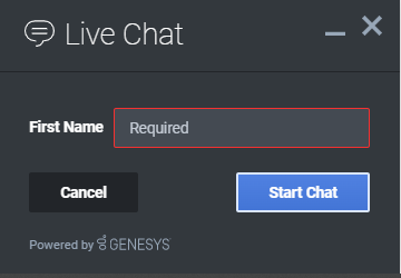
You must return true or false to indicate that validation has passed or failed, respectively. If you return false, the WebChat form will not submit, and the input will be highlighted in red. This is achieved by adding the CSS class "cx-error" to the input. The image below displays the the field where a user input validation error has occurred, with the field highlighted in red.
Validation Function Arguments
| Argument | Type | Description |
|---|---|---|
| event | JavaScript event object | The input event reference object related to the form input field. This event data can be helpful to perform actions like active validation on an input field while the user is typing. |
| form | HTML reference | A jquery reference to the form wrapper element. |
| input | HTML reference | A jquery reference to the input element being validated. |
| label | HTML reference | A jquery reference to the label for the input being validated. |
| $ | jquery instance | Widget’s internal jquery instance. Use this to help you write your validation logic, if needed. |
| CXBus | CXBus instance | Widget’s internal CXBus reference. Use this to call commands on the bus, if needed. |
| Common | Function Library | Widget’s internal Common library of functions and utilities. Use if needed. |
Form Submit
Custom input field form values are submitted to the server as key value pairs under the userData section of the form submit request, where input field names will be the property keys. During the submit, this data is merged along with the userData defined in the WebChat open command.
Below is the internal form data object defined in the WebChat Plugin by default. Since firstname, lastname, nickname, email, and subject are reserved keywords, users are not allowed to have custom fields with the same name.
{
  firstname: '',
  lastname: '',
  nickname: '',
  email: '',
  subject: '',
  userData: {}
}
Example
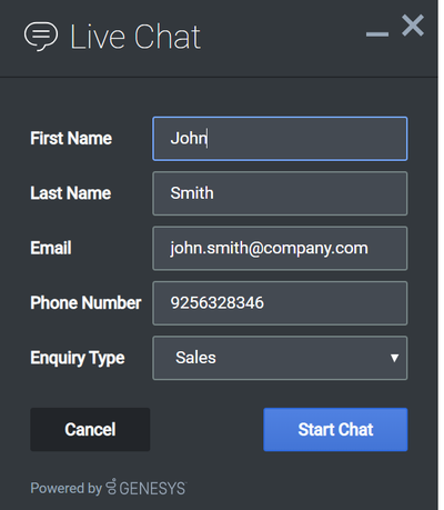
The example below shows how the custom form data given in the WebChat form fields have been mapped as a form data object.
The form fields with reserved keywords like firstname, lastname, and email will be sent as top level and the rest of the fields will be sent under userData to the WebChatService plugin.
Once the form data object is sent to the WebChatService plugin, it will parse and send in the payload request.
{
    "wrapper":"<table></table>",
    "inputs":[
        {
            "id":"cx_webchat_form_firstname",
            "name":"firstname",
            "type":"text",
            "maxlength":"100",
            "placeholder":"@i18n:webchat.ChatFormPlaceholderFirstName",
            "label":"@i18n:webchat.ChatFormFirstName",
            "value":"John"
        },
        {
            "id":"cx_webchat_form_lastname",
            "name":"lastname",
            "type":"text",
            "maxlength":"100",
            "placeholder":"@i18n:webchat.ChatFormPlaceholderLastName",
            "label":"@i18n:webchat.ChatFormLastName",
            "value":"Smith"
        },
        {
            "id":"cx_webchat_form_email",
            "name":"email",
            "type":"text",
            "maxlength":"100",
            "placeholder":"@i18n:webchat.ChatFormPlaceholderEmail",
            "label":"Email",
            "value":"john.smith@company.com"
        },
        {
            "id":"cx_webchat_form_phonenumber",
            "name":"phonenumber",
            "type":"text",
            "maxlength":"100",
            "placeholder":"Phone Number",
            "label":"Phone Number",
            "value":"9256328346"
        },
        {
            "id":"cx_webchat_form_enquirytype",
            "name":"enquirytype",
            "type":"select",
            "label":"Enquiry Type",
            "options":[
                {
                    "text":"Account",
                    "group":true
                },
                {
                    "text":"Sales",
                    "value":"Sales",
                    "selected":true
                },
                {
                    "text":"Credit Card",
                    "value":"credit card"
                },
                {
                    "text":"General",
                    "group":true
                },
                {
                    "text":"Warranty",
                    "value":"warranty"
                },
                {
                    "text":"Return policy",
                    "value":"returns"
                }
            ]
        }
    ]
}
{
  firstname: 'John',
  lastname: 'Smith',
  email: 'john.smith@company.com',
  userData: {
    phonenumber: '9256328346',
    enquirytype: 'Sales' //value selected from the dropdown
  }
}


