Contents
Toaster
Overview
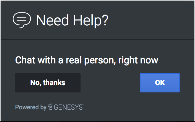
The Toaster plugin provides a toast view control that widgets can inject their UI into. The Toaster plugin accepts an HTML UI and puts it inside a toast view and displays the UI onscreen in the lower-bottom-right of the screen. When it is opened it will slide up from the bottom. When it is closed it will slide down until it is offscreen.
Toaster provides these benefits:
- Shows UI as a slide-up toast view in the lower-bottom-right of the screen.
- Open and close transition animations.
- No overlapping toasts, only one at a time. Automatically managed by the Toaster plugin.
Usage
Toaster is very easy to use; you simply open and close it. When you call Toaster.open, you pass-in the HTML content you want to show. If you call Toaster.open again while a toast is already open, it will automatically close the previous toast before showing yours (unless the previous toast has reserved the view to prevent new toasts).
Namespace
Toaster plugin has the following namespaces tied-up with each of the following types.
| Type | Namespace |
|---|---|
| CXBus - API Commands & API Events | Toaster |
| CSS | .cx-toaster |
Customization
Toaster does not have customization options.
Mobile Support
Toaster does not have mobile-specific styles at this time.

