Contents
User Interface
Supported browsers
Designer supports the latest versions of the following web browsers:
- Mozilla Firefox
- Google Chrome
- Microsoft Edge
- Apple Safari
User interface overview
Watch this video to see an overview of the Designer user interface:
The various elements within the interface are described below.
Provides one-click access to Applications, Shared Modules, Audio Resources, Speech Grammars, and Business Controls objects.
Workspace toolbar
Provides buttons for common actions. Click your user name to log off. Click the settings icon to view or modify the global Caching settings for certain resources and to toggle certain Features. Click the Help icon to access the Designer Help.
Application toolbar
Provides buttons for common actions. Click Settings to set global settings for your application. Click Save Flow to save and validate your application, or click Publish to save and validate your application and prepare it for use by routing engines.
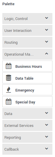
Palette
Provides all available blocks that you can use in your application, sorted by functional grouping:
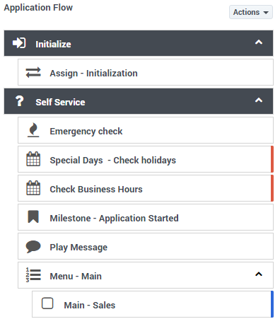
Application flow
Provides the main area to build your application by adding blocks vertically. (See Build Logic for more information.)
Help pane
Displays help information for the selected block:
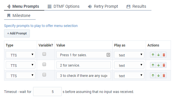
Block properties
Displays all properties exposed by a block and provides assistance to set them:
Quick filters
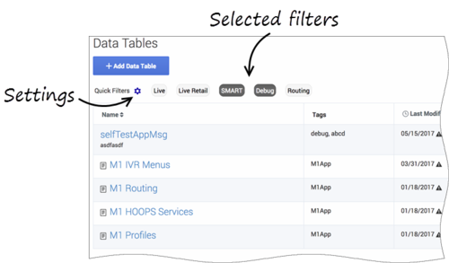
This toolbar enables you to filter a list of resource items by selecting one or more filters that are associated with tags. The list then refreshes to show only those items that match the selected filters.
In this example, the SMART and Debug filters are selected so that only data tables with those tags are shown:
Note that the filters will display any item in the list that has the associated tag, even if there are other tags associated with that item. If you navigate to a new resource page (such as going from Data Tables to Business Hours), any selected filters are automatically applied to the new page.
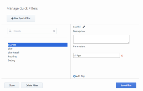
To add, modify, or delete quick filters, click the Settings icon to open the Manage Quick Filters window. To associate a filter with a specific tag, select it, and add the tag(s) under the Parameters section.
In the above example, the SMART filter was associated with the "M1App" tag, as follows:
The Quick Filters toolbar appears on the following resource pages: Special Days, Business Hours, Data Tables, Applications, Shared Modules, Emergency Flags, Audio Collections, and Message Resources. The same filters appear on each page, and any filters that you create are visible to other Designer users.


