Durations
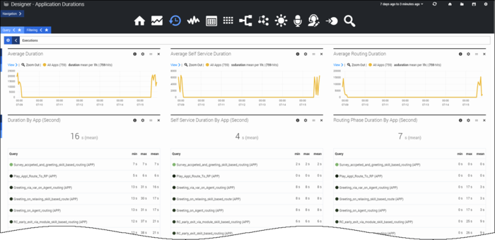
The Durations dashboard shows you how much time (in seconds) your callers are spending in the different phases of the application flow.
This dashboard can quickly show you:
- if callers are spending more time than expected in the Self Service or Assisted Service phases of an application
- if the amount of time callers are spending in certain sections of an application varies at different times
- any other unusual peaks in time being spent
The reports on this dashboard can help you determine if there are any possible issues with the application or its flow design, such as callers finding it difficult to navigate.
Reports on this dashboard
Count Over Time
(See the Summary dashboard for a description of this report.)
Filter
(See the Summary dashboard for a description of this panel.)
Average Duration
The average duration of time (in seconds) for all interactions across all applications. This data is captured for every 5-minute interval and then plotted as a line graph for the last 7 days.
Average Self Service Duration
The average time (in seconds) that callers are spending in the Self Service phase of the application, across all applications.
Average Routing Duration
The average time (in seconds) that callers are spending in the Assisted Service phase of the application, across all applications.
Routing Phase Duration by App
The amount of time (in seconds) callers are spending in the Assisted Service phases of the application, broken down by application.
Self Service Duration by App
The amount of time (in seconds) callers are spending in the Self Service phases of the application, broken down by application.

