Path
This dashboard provides a visualization of how callers are moving through the applications by tracing their path through various nodes.
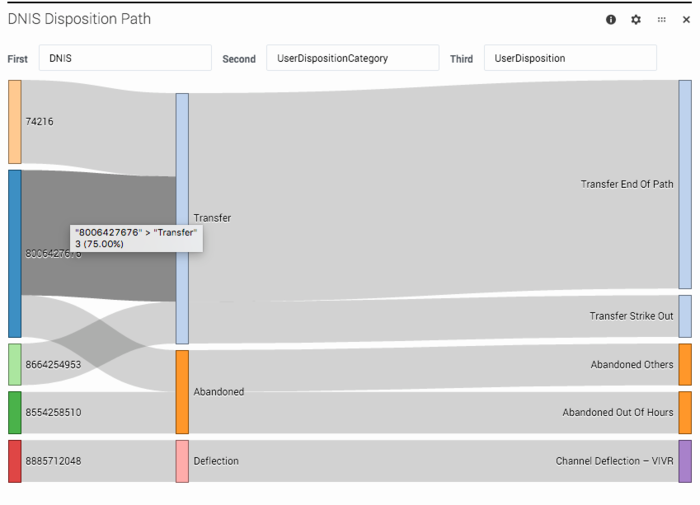
Looking at this sample report, there are three nodes selected:
- First = DNIS, which is the number that callers dialed
- Second = UserDispositionCategory, which is the top-level disposition category (for example, Transfer)
- Third = UserDisposition, which is how the call finally ended up within that disposition category (for example, Transfer End of Path)
For each application session that took place during the selected time, a line is drawn between each node to represent the path that callers took. As more sessions share a common path, the path gets thicker.
You can easily see how callers are navigating through the application flows and quickly adjust the selected nodes to build paths for other values and categories.
Reports on this dashboard
Count Over Time
(See Count Over Time.)
Filter
(See Filter.)
DNIS Disposition Path
This path shows how the sessions are tracking by dialed number through the high-level disposition categories (such as Transfer or Abandoned) to a final disposition (such as Transfer End of Path or Abandoned Out of Hours).
DNIS Call Type Exit Point
This path shows how sessions are tracking from each dialed number by call-type, through to the exit point of the call (the block where the caller hung up).
CallType Disposition Path
This path shows how the sessions are tracking for each call type, through the high-level disposition categories to a final disposition.
Call Type Disposition Exit Point
This path shows how the sessions are tracking by call type, through the high-level disposition categories to the exit point of the call (the block where the caller hung up).

