Contents
Feature Analysis Report
The Feature Analysis report provides a starting point for the process of creating Predictors and Models. It enables you to determine which factors—agent and customer characteristics and behavior—have the most impact on a target metric you select.
You can run a Feature Analysis for your dataset (from the Datasets tab) or for a specific Predictor (from the Predictors tab). The Feature Analysis for the Dataset considers all features in the Dataset. The Feature Analysis for the Predictor only considers those features included in the Predictor.
The Feature Analysis report returns only those features (also referred as attributes) that most influence the target metric. The features are ranked, from the one with the strongest impact on the target metric to the one with the least. Each subsequent feature is ranked in relation to the most powerful one. Therefore, a feature with a numeric ranking of 0.5 is half as powerful as the highest-ranked feature.
By default, the report displays only the attributes with the strongest impact on the target metric. Use this aspect of the functionality to identify, and then omit from the Models you create, attributes with an insignificant impact on the value of the target metric. This way, you can focus your Model on the most powerful attributes.
Although not all features are shown by default, the report does contain data for all features. If a feature has minimal impact, it does not affect the outcome of the report.
- Predictive Routing supports report generation that includes up to 250 features (columns).
- For all reports, mandatory fields are marked with an asterisk.
- When a Dataset has many fields, you can hide some to view the most relevant fields more easily. Hiding fields only removes them from your view. Hidden fields are still used in Feature Analysis reports for Predictors and Datasets.
Feature Analysis End-to-End Example
Alissa's business is plagued with escalations and frustrated customers who have to contact their agents multiple times to resolve issues. She needs to improve first contact resolution, but a scan of the data leaves her confused. Each case seems so different. How can she tell what aspects of the environment to target for quick, lasting results?
Alissa starts by compiling and importing a high-quality Dataset. She makes sure of the following points about her Dataset:
- It contains at least three months' worth of contact center data.
- It includes data from all the queues she needs to evaluate.
- If an agent is included in the Dataset, all that agent's interactions for the covered period are included.
With the data in place, Alissa runs a Feature Analysis report using FCR as the target metric.
The outcome lists the Dataset fields having the strongest effect on FCR. The feature, or aspect of the environment, having the greatest impact on FCR is listed first and given a weight of 1. All other features are compared with the highest-ranked feature and given a ranking that expresses how strongly they affect the target metric relative to the top feature. If a feature has a value of 0.75, that means it has 3/4 as much impact as the top feature.
Now that Alissa know which are the most critical features in her environment, she can use this information to construct a better Models for the predictor in her environment Predictor that uses FCR as the target metric. Although the Predictor includes all features, when Alissa creates Models based on the Predictor, she configures them with only those features that the Feature Analysis report identified as most important.
Alissa takes the top ten features as a starting point for her first Model. She knows that if she selects only some of the high-ranked features—the features ranked, for example, at 1, 3, 4, and 6—she will be second-guessing the algorithm. The Feature Analysis accounts for the fact that the features can be interrelated and affect each other. If Alissa arbitrarily selects only a few of the top features, her Model will be weaker and less accurate than it should be.
So, by using the results of the Feature Analysis report, Alissa removes features that are minimally relevant from her Model, enabling her to focus on the key factors. She can create and run Models efficiently, with less load on her system. She can also target her company's efforts to allocate resources and provide training toward those areas that will drive the greatest improvements to the target metric.
Once the Model is in place, Alissa can run a Lift Estimation report, which provides a preliminary assessment of the projected improvement she might expect for the selected target metric, based on the features included in the Model.
After configuring her company's routing strategies to use baseline routing for some interactions and using GPR for the rest, Alissa can perform a real-world A/B test of how well GPR performs over time when compared against the baseline routing without GPR. With at least three months' worth of data, she can see the real-world results that the Lift Estimation report simply estimated. She runs a Predictive Routing A/B Testing Report in Genesys CX Insights, using Genesys Historical Reporting.
However, she's careful to monitor whether there are changes to the Dataset that affect the environment in ways that make it necessary to create a train a new Model. For example, changes in the environment that might cause features to gain or lose importance in how much they affect the target metric. After new data is appended to the Dataset, and obsolete data purged, Alissa can repeat the steps to regenerate Predictor data, run a new Feature Analysis report, and then create and train new Models.
For example, Alissa's company has created a new IVR flow that directs certain types of challenging interactions to a new agent group that is specially trained to handle such issues. By rerunning the Feature Analysis report based on the new conditions in the environment, Alissa can quickly gather better insight on how to set up new Models to replace the now-outdated ones.
How to Generate a Feature Analysis Report
Run Feature Analysis reports from the Predictors tab and the Datasets tab. Use the following procedure to create a Feature Analysis report:
- Click the Predictors tab or Dataset tab on the top navigation bar. To analyze a model, click Predictors.
- Click Analysis. This button is located on the right side of the top navigation bar.
- Select Feature Analysis from the drop-down Report menu.
- Choose the parameters you want to include using the selectors on the left side of the window.
- Click Run Analysis.
The result appears on the Reports tab for the object you are analyzing. That is, if you are running an analysis of a dataset, the result appears on the Reports tab on the Datasets tab window.
Tips for Creating an Effective Feature Analysis Report
When you create a Feature Analysis report for a predictor, Predictive Routing extracts input data from the predictor, such as the target metric. When you run the report for a dataset, you must manually select the target metric. However, when you click Run Analysis, the algorithm used is identical.
The Feature Analysis report uses two types of analysis depending on the target metric type:
- Numeric (continuous): The Feature Analysis report uses regression analysis, which predicts the output value using training data.
- Boolean: The Feature Analysis report uses classification analysis, which groups the output values into two classes, true and false.
Target Metrics <metric_name> Range: Appears only if your target metric is numeric. The Target Metric Ranges slider converts a numeric—regression—metric into a classification metric. For example, if you have a numeric metric with a range from 0-10, you can adjust the slider to divide the outcome results into two or three classes or buckets. You might move the buttons to create one bucket from 0-3, one from 4-6, and one for 6 and higher. To create two buckets, leave one button at the far end of the slider and use the other to divide the bar.
- Creating these buckets sets the Features Analysis report to use classification analysis on the target metric, rather than regression analysis. So the same numeric target metric could produce different results depending on which underlying analysis type you specify.
- To have the Feature Analysis report use regression analysis, leave both buttons at the far ends of the bar, to create a single bucket.
- If the report for a numeric metric is taking an unacceptably long time to run, you can speed processing by dividing the possible values into buckets. To do this, you need to have some understanding of how dividing the data into buckets affects the outcome. This scenario requires input from your data science team and might require experimentation to determine the best trade-off between the need for fine-grained detail, which is coarsened by bucketing, and the need to improve processing speed.
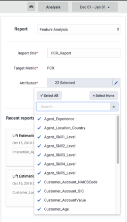
Attributes: When you are setting the report parameters, all features/attributes are available for selection. Selected attributes have a check mark next to the name. Click the attribute to toggle the check mark on or off. To add all or remove all, click Select All or Select None.
- You can select up to 250 attributes. For help understanding how GPR analyzes and displays attributes, refer to the section below.
View a Feature Analysis Report
To view a report:
- Click a report to view it from the list in the Run Analysis window; or
- Click the Reports tab and select it from the list on the left side of the tab.
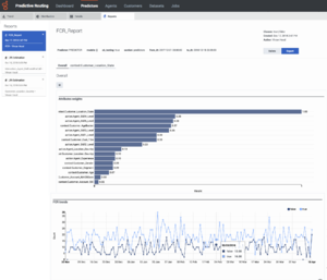
The report window is large and contains a number of sections and options for how to view the analysis results. The thumbnail on the right shows the entire window, for your reference (click to enlarge it). The sections that follow explain the report display, section by section.
Report Header and Tabs
By default, the report opens showing an Overall view of the data. All attributes (features) you selected for the report and which have a relative weight greater than one-half percent (0.5%) are listed on tabs under the report name, so you can view analyses of the data for each feature.
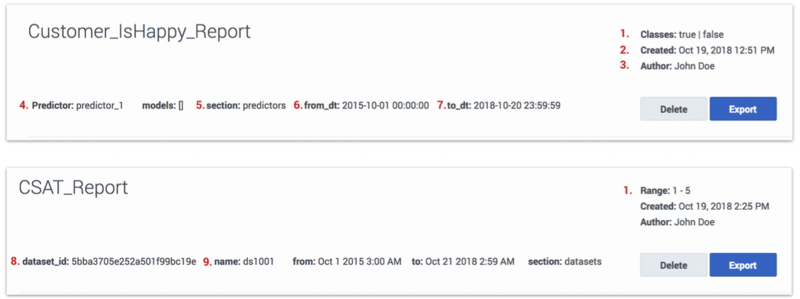
- The numbers on the following graphic correspond to the field descriptions (below the graphic).
- Classes/Range:
- Classes - The target metric for the report is Boolean, or a numeric target metric was bucketed using the Target Metrics Range setting. The Classification algorithm was used to create the report, the label reads Classes, and lists all identified classes.
- Range - The target metric is numeric. The Regression algorithm was used to create the report, the label reads Range, and displays the minimum and maximum values for the metric.
- Created: Date the report was generated.
- Author: Name of the user who generated the report.
- Predictor: Name of the Predictor used to generate the report (applicable only for reports run on a Predictor).
- Section: Object on which the report is built, either predictors or datasets.
- From_dt: Dataset start date.
- To_dt: Dataset end date.
- Dataset_id: ID of the Dataset used for analysis (applicable only for reports run on a Dataset).
- Name: Name of the Dataset used for analysis (applicable only for reports run on a Dataset).
The header also contains the following objects:
- Delete button: Entirely removes the report from your reports list.
- Export button: Creates a CSV file containing the report data for the currently-selected tab.
- Tabs: Features that are analyzed to have the strongest impact on the target metric appear as tabs above the report graph or table. All features with a weight of at least 0.5 relative to the most powerful feature appear as tabs.
Report Graph or Table
The button at the top left of the graph enables you to toggle between the chart view (shown here) and a tabular view.
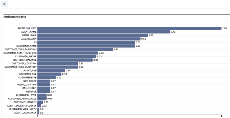
- The Overall view contains a graph listing the features ranked according to how strongly they affect the target metric. The feature that affects the metric most strongly is assigned a value of 1.0 and the remainder are assigned numbers that indicate how influential they are relative to the strongest feature. All features with a weight of 0.5% or higher are displayed.
- For example, you might have three features, ranked as follows: FeatureA = 1.0, FeatureB = 0.86, and FeatureC = 0.54. These numbers indicate that FeatureB has only 86% as much weight in affecting the target metric as FeatureA, and FeatureC 54% of the impact on the target metric. These values are relative to the most impactful feature, not an absolute measure of their impact on the target metric.
- ImportantIf the Dataset you are using to run the report has more than 100,000 samples for a feature, GPR samples the rows for that feature randomly. As a result, in such cases, the Feature Analysis report might produce slightly different results when running the report on the same Dataset with the same parameters selected.
- Click a tab for a specific feature on the top section of the report to view a chart displaying data for that feature only.
- Click the bar on the graph for a feature with a weight less than 0.5 (that is, for which a tab is not generated by default) to have a new tab open showing a chart of that feature. Note that this tab is displayed only until you navigate away from it.
Report Trends Graph
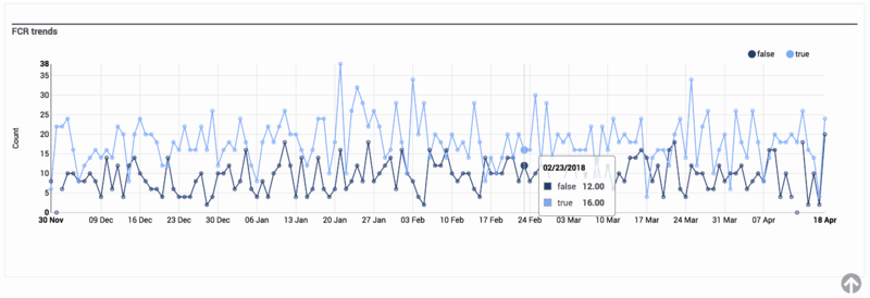
In the Overall view, the second chart shows the target metric values over time.
- Hover over any chart to view a tooltip containing information about that exact data point.
- To toggle between a table view and a chart view of the report, click the icon at the top left corner of the top-most chart or table.
- To drill down to more granular data about a specific feature, click its name from the list above the graphical display. By default, tabs for feature sub-reports are visible only for features with a weight greater than 0.5. To access sub-reports for features weighted less than 0.5, click the corresponding bar in the bar chart.
- The charts change to show data relevant to how that feature affects the target metric.
- When you are viewing charts for a specific feature, the score for that attribute is provided in a gray oval next to the feature name.
- To export the results of a Feature Analysis report, click Export. The export contains all of the features and the weights determined for them. You can save the file in Excel format.


