Contents
Calendar
Overview
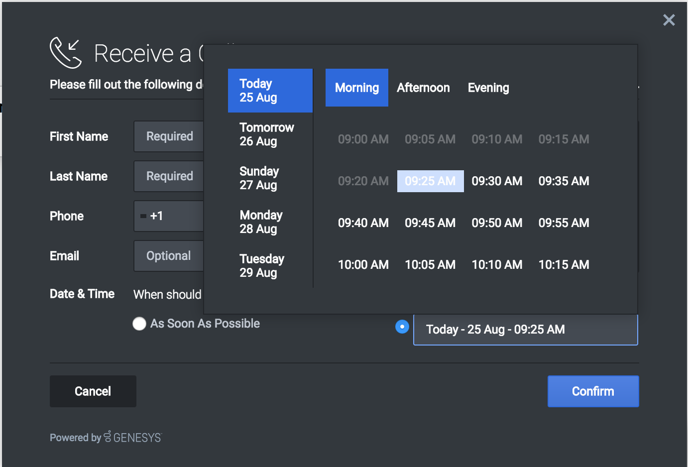
Calendar widget is a UI Plugin that displays time-slots for a selected day. Each day is divided into 3 sections (for example, 'Morning', 'Afternoon' and 'Evening'). The number of days to display, as well as open time and close time for a day are configurable as shown in Configuration.
Usage
- Enable/Disable certain sections of a day using calendarHours.section.enable
- Define your own business hours for each section of a day using calendarHours.section.openTime and calendarHours.section.closeTime.
- Use showAvailability configuration to enable only those time-slots for which a customer service agent is available and disable the remaining.
- Define your own time interval between each time-slot.
Customization
All the texts shown in calendar widget are fully localizable as shown in Localization
Namespace
Calendar plugin has the following namespaces tied-up with each of the following types.
| Type | Namespace |
|---|---|
| Configuration | calendar |
| i18n - Localization | calendar |
| CXBus - API Commands & API Events | Calendar |
| CSS | .cx-calendar |
Mobile Support
Calendar supports both desktop and mobile devices. Like all Genesys Widgets, there are two main modes: Desktop & Mobile. Desktop is employed for monitors, laptops, and tablets. Mobile is employed for smartphones. When a smartphone is detected, Calendar switches to special full-screen templates that are optimized for both portrait and landscape orientations.
Switching between desktop and mobile mode is done automatically by default. You may configure Genesys Widgets to switch between Desktop and Mobile mode manually if necessary.
Screenshots
"Dark" Theme
"Light" Theme


