Contents
Applying CSS to WebIVR MicroApps
This page describes the CSS classes that are rendered into HTML at runtime for WebIVR MicroApps.
Genesys Intelligent Automation provides a user-friendly interface for designing visual themes for MicroApps (refer to the Help for more information). However, the information on this page allows web designers to directly configure CSS for MicroApps using the CSS Override section in the Personas > Themes view.
Overview
Body
The MicroApp body uses the class body.
<body class="body">Title bar
The MicroApp title bar uses a div element and an h1 element. The div element uses the class title-bar and the h1 element uses the class title-bar-text.
<div class="title-bar">
<h1 class="title-bar-text" id="title-bar-text">Title</h1>
</div>
Central area
The central area of the MicroApp renders into the body and uses three div elements, with the classes being outer, middle, and blocks-container (from outermost to innermost).
<div class="outer">
<div class="middle">
 <div class="blocks-container" id="blocks-container">
...
</div>
</div>
</div>The MicroApp footer uses the class footer. GAAP uses footers to hold buttons related to dialog defaults, as well as the End button (the End button is always present to allow the caller to end the session, as closing the window does not end the session on iOS Safari). Defaults such as Agent also render in the footer.
MicroApps render buttons as anchor elements with the default-menu-option class. The global menu option has the menu_option_agent class (the name of the global option is appended). Consequently, you can individually style added options.
The footer is divided into two other div elements (with classes close-footer-button-container and footer-buttons) to separate the End button and the other menu options.
<div class="footer">
<div class="close-footer-button-container">
<a class="default-menu-option" id="close-window-button">End</a>
</div>
<div class="footer-buttons" id="footer-buttons">
<a class="default-menu-option menu_option_agent">Agent</a>
</div>
</div>
Blocks
Blocks render inside the div class blocks-container.
<class="blocks-container" id="blocks-container">As the rendered class is also the name of the block, and thus separate from other elements, you can assign individual styling to each block.
If the block name has spaces, GAAP replaces these spaces with underscores and prepends the word block. If the block uses a persona, a persona class is also rendered onto the block.
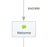
The following example shows a Message block with no set persona:
The above example renders the following:
<div class="block block_Welcome persona_">Where:
- block—specifies this class as a block.
- block_Welcome—specifies the block name with block_ prefix.
- persona_—specifies the persona used by the block. In this example, the block uses the default persona and a persona name is not specified.
Prompts
You can use prompts in Message, Menu, Question, and Recording blocks. Prompts render inside div elements that identify the block to which they belong. You can insert prompts by using their reference number. For example, the prompt below uses reference 0032.
This renders as:
<div class="prompt-0032">
Hey, I'm Kate!
</div>
The following section describes prompt use by block type.
Message blocks
Message blocks output a prompt to the IVR or, in this case, text to a MicroApp. GAAP renders them in a div with classes indent-right and message-prompt. Inside another div, Message blocks render with a class that is individual to the prompt by using the prompt reference, as noted above in the Prompts section.
<div class="indent-right message-prompt">
<div class="prompt-0032">
Hey, I'm Kate!
</div>
</div>
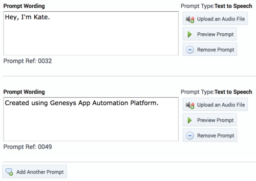
Blocks can contain multiple prompts, with each prompt referring to the prompt reference number, as shown in the following example:
The example above renders as:
<div class="indent-right message-prompt">
<div class="prompt-0032">
Hey, I'm Kate!
</div>
<div class="prompt-0049">
Created using Genesys App Automation Platform.
</div>
</div>
Menu and Question blocks
You can group prompts in these blocks into a div element with class menu-prompts-container.
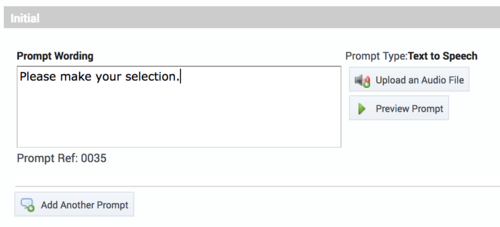
Initial prompt
The above graphic shows text in the Initial prompt section. Consequently, this renders an outer div with class menu-initial-prompt and an inner div.
<div class="menu-initial-prompt" id="initialPromptDiv">
<div class="prompt-0035">
Please make your selection.
</div>
</div>
Retry prompt
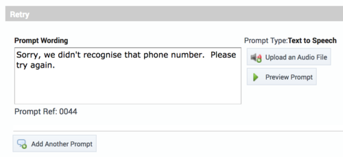
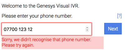
If the user fails validation on a Question block (such as by entering an invalid phone number), the Retry prompt displays below the input area, with the class validation-message. The input field also has the class validationErrorFrame to highlight the area.
The graphic below shows how this prompt appears in the MicroApp:
Intelligent Automation renders this as a span element inside the question-input-container class, below the input field.
<span class="validation-message">Sorry, we didn't recognize that phone number. Please try again.</span>Help prompt
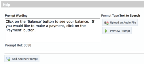
The Help prompt is initially hidden in the MicroApp—it displays only if the user clicks the ? link rendered beside the Initial prompt.
When the user clicks ?, the following outer div with class menu-help-prompt displays, and the original prompt is hidden until ? is clicked again.
<div class="menu-help-prompt" id="helpPromptDiv">
<div class="prompt-0038">
Click 'Balance' to see your balance.  If you would like to make a payment, click 'Payment'.
</div>
</div>
The question mark rendered with the class switch-prompts:
<a class="switch-prompts">[?]</a>The render for the prompts thus far is:
<div class="menu-prompts-container">
<div class="menu-initial-prompt" id="initialPromptDiv">
<div class="prompt-0035">
Please make your selection.
</div>
</div>
<div class="menu-help-prompt” id="helpPromptDiv">
<div class="prompt-0038">
Click 'Balance' to see your balance.  If you would like to make a payment, click 'Payment'.
</div>
</div>
<a class="switch-prompts">[?]</a>
</div>
Buttons
If the menu uses buttons, each menu choice renders as an input element. Intelligent Automation assigns the menu-option class to each choice, and then appends an individual class with the name of the option, such as menu_option_<choice here>.
<input class="menu-option menu_option_balance" value="balance" type="submit">
<input class="menu-option menu_option_payment" value="payment" type="submit">
Choices in Question blocks
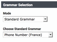
The following sections describe the different grammar types and how they dictate the HTML and associated CSS classes rendered. Each choice selection has an associated Confirm button rendered with the submit-button class.
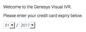
<input class="submit-button" type="submit" value="Next">Credit Card Expiry
Use the ID selector as shown below.
<select id="CreditCardExpiryMonths">
<option value="01">01</option>
<option value="02">02</option>
<option value="03">03</option>
…
<option value="10">10</option>
<option value="11">11</option>
<option value="12">12</option>
</select>
/
<select id="CreditCardExpiryYears">
<option value="2020">2020</option>
<option value="2019">2019</option>
<option value="2018">2018</option>
<option value="2017" selected="">2017</option>
<option value="2016">2016</option>
<option value="2015">2015</option>
<option value="2014">2014</option>
</select>
The preceding code renders as:
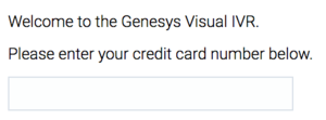
Credit card number
Credit card numbers use an input box with the class question-input-field.
<input class="question-input-field"="text">The preceding code renders as:
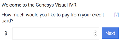
Currency
Currency grammars use a label and an input field with the classes currency-symbol-indent and question-input-field, respectively.
<label class="currency-symbol-indent"> € </label>
<input class="question-input-field" type="number">
The preceding code renders as:
Date
Date grammars render two components. First, it renders an input field that holds the date, which is styled with the question-input-field class. An icon is placed alongside the input field, which opens the date-picker when clicked. This link uses the date-picker-control class.
<input class="question-input-field" id="Date" name="Date" type="text">
<a class="date-picker-control" title="Show Calendar" id="fd-but-Date">
<span class="fd-screen-reader">Show Calendar</span>
</a>
The preceding code renders as:
When the user clicks the icon, the date-picker opens.
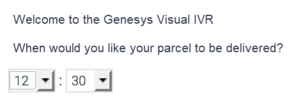
Time
The time input renders as drop-down menus—one for hours and one for minutes. Each uses an ID selector.
<select id="TimeHours">
<option value="00">00</option>
<option value="01">01</option>
<option value="02">02</option>
<option value="03">03</option>
…
<option value="21">21</option>
<option value="22">22</option>
<option value="23">23</option>
</select>
:
<select id="TimeMinutes">
<option value="00">00</option>
<option value="01">01</option>
<option value="02">02</option>
…
<option value="57">57</option>
<option value="58">58</option>
<option value="59">59</option>
</select>
The preceding code renders as:
Natural numbers
Natural numbers use a standard field with the question-input-field class.
<input class="question-input-field" type="number">Telephone
Telephone numbers use a standard field with the question-input-field class.
<input class="question-input-field" type="tel">Grammar Builder
Grammar Builder uses a standard field with the question-input-field class.
<input class="question-input-field" type="text">Recording blocks
The Recording block requests permission from users to use their microphone to capture an audio recording. It displays buttons to start and stop the recording, which use the recording-button-wrapper class. After recording, the user clicks the Next button, which uses the recording-done-button-wrapper class. These elements are wrapped inside a form that can be styled using the ID selector recordingform. Above these controls is a prompt for indicating to users that they can make a recording, using the standard prompt CSS format mentioned earlier on this page.
<div class="prompt-0047">
Please state your comments now.
</div>

<form id="recordingform">
<div class="recording-button-wrapper">
<input class="recording-button" type="submit" value="Start recording">
</div>
<div class="recording-done-button-wrapper">
<input class="submit-button" type="submit" value="Next">
</div>
</form>
</div>
The preceding code renders as:
Styling Tips
This section provides basic tips for styling MicroApps.
- Make full use of the space available, while taking into consideration the various screen formats that you need to support. For example, are you targeting phones only, or also desktops? Use media queries for responsive design to ensure your MicroApp looks good regardless of device.
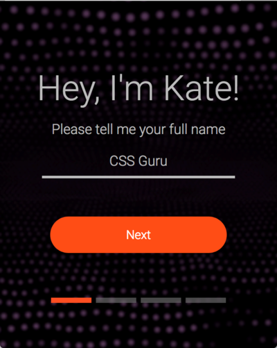
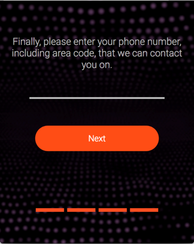
- The example below uses a large button and simple messaging to make the goal obvious to the user. It also uses a background image for depth. It maintains a consistent style and font, and elements are centered.
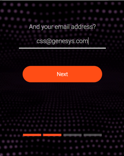
- You can use blocks and prompts in inventive ways. In the preceding and following graphics, you can see a progress bar appears beneath the button to guide the user through the MicroApp. You can use this approach by applying an image to a block that is only present at a certain step along the user journey.
- The example above requests an email address. This uses Grammar Builder, which renders an input box for user entry. It is styled through CSS to give a simple underline, but it also uses Grammar Builder to supply regular expressions to ensure only valid email addresses are supplied. Regular expressions can validate a wide variety of user inputs.
- Drop-down options can use CSS to provide clean styling that matches the rest of the design. You can provide additional icons, or apply base64 encoding in the CSS.
- You can use regular expressions to validate user input, or you can use one of the validators that come with GAAP.
Selector reference
This section lists the various elements you can call in your MicroApp.
| Selector | Use |
|---|---|
| block | Assigned to the div that holds the content of the block. |
| block_<block-name> | Assigned to the same element as block, but allows tweaking of the style on a block-by-block basis. |
| blocks-container | Assigned to the div that holds all blocks. More than one block can be rendered inside a blocks-container, such as two Message blocks followed by a Question block. |
| body | Assigned to the body element for the entire window. |
| close-footer-button-container | Assigned to the div inside the footer that contains the End button. This button ends the session. |
| currency-symbol-indent | Assigned to the label that holds the currency symbol if a Question block requests monetary input. |
| date-picker-control | Assigned to the anchor tag that holds the date icon, which the user clicks to open the date-picker window. |
| default-menu-option | Assigned to all buttons that appear in the footer. |
| footer | Assigned to the div that contains all footer elements. This element is the parent of close-footer-button-container and footer-buttons. |
| footer-buttons | Assigned to the div that holds all buttons for default options. For example, if a general Agent global menu is set, it appears as a div inside this element (though it is assigned menu_option_<option-name>). |
| indent-right | Frequently used on container div elements to keep the content separated from the left border of the window. |
| message-prompt | Assigned to div elements that house prompts used for Message blocks. |
| menu-help-prompt | Assigned to the div that contains the Menu or Question block Help prompt. |
| menu-initial-prompt | Assigned to the div that contains the Menu or Question block Initial prompt. |
| menu-retry-prompt | Assigned to the div that contains the Menu or Question block Retry prompt. |
| menu-option | Assigned to all menu option div elements. |
| menu_option_<menu-choice> | Assigned to all menu options, but with the option appended to the end, thus allowing control over the styling of specific options. |
| menu-options-container | Assigned to the div that surrounds all menu options. |
| menu-prompts-container | Assigned to the div that surrounds all Menu or Question block prompts. |
| middle | Assigned to the div that allows some control over the central elements. |
| outer | Assigned to the div that allows some control over the central elements. Encompasses the middle element. |
| persona_<persona-name> | Additional class assigned to indicate the persona. If the default persona is active, no content appears after the underscore character. This allows styling control at a persona level. For example, persona_ is assigned on blocks that have no explicit persona set (the default). However, you might assign persona_italy if an Italian persona has been created and made active. |
| prompt-<prompt-ref> | Assigned to all div elements that contain prompts. This allows individual styling on a prompt-by-prompt basis. |
| question-input-container | Assigned to the div that contains all Question block elements, regardless of the input type (example: date, credit card, currency, and so on). |
| question-input-field | Assigned to the div that is used for general input (example: natural numbers, phone number, and so on). Note: Server-side validation still occurs based on the grammar type. Failed validation results in hiding the Initial prompt and showing the Retry prompt. |
| recording-button | Assigned to the div that controls recording. |
| recording-done-button-wrapper | Assigned to the div that wraps both the recording functionality, as well as the Next button. |
| submit-button | Assigned to any div that is acting as a form of submit type. Can be used to proceed on Menu block options whereby the number of items is beyond the value configured for button rendering, or for Question and Recording blocks. |
| switch-prompts | Assigned to the anchor element that allows switching between Initial and Help prompts. |
| title-bar | Assigned to the div that holds the title bar area. |
| title-bar-text | Assigned to the div that holds the text for the title bar. |
| validationErrorFrame | Applied to the div on which the input failed. |
| validation-message | Applied to a span element that is added if validation failed. |


