Contents
Graphing Metrics and Time Profiles
There are options within the Metric Graphing window that help you to analyze the data from a selection of metrics. You can use the window to get an overall view of the day, or to pinpoint a 15-minute time frame and examine what was happening at that time.
Administrators select which metrics and time profiles are available for you to graph. To graph one or multiple metrics:
- Select an object on the Contact Centers pane, an application on the Applications pane, or a contact group on the Contact Groups pane. Look for the Charting button (
 ) beside the name of the object, application, or contact group for which you want to graph metrics; you can graph metrics for an object only if the Charting button is displayed for that object.
 - Click the Charting button in the selected row. If there are metrics for the selected object, application, or contact group that cannot be graphed, then those metrics will be disabled (grayed out) in the list of available metrics in the Metric Graphing window.
Once you have a Metric Graphing window open, you can do the following:
- Set up the Graphing Area
- Change the Metric Selection or Graph Type
- Work with Time Intervals
- Arrange Metrics and Modify Color Selections
The timestamp that displays at the top of the Metric Graphing window indicates when the metric data in the graph was last updated.
Set up the Graphing Area
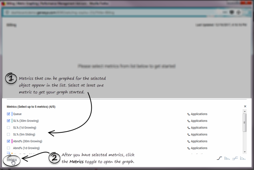
When you first open a Metric Graphing window for an object, you are prompted to select at least one metric to display on the graph. Once you have at least one metric selected to graph, click the Metrics toggle at the bottom of the window to create the graph.
Change the Metric Selection or Graph Type
After you have a graph set up, you can return to the list of available metrics to change your metric selection. You can also easily change the style of the graph.
| 1. Select or deselect metrics for the graph. | Once you have a graph established, you can click the Metrics toggle to alternately open and close the list of metrics that are available for graphing. You can select additional metrics for your graph, or deselect metrics to remove them from the graph. Metrics are identified by the display name. |
| 2. Select the style of graph. | Select one of the following graph styles:
You can change the graph style at any time while working in the Metric Graphing window. |
Work with Time Intervals
There are times when you might want to review data for a specific time interval; perhaps even for a five-minute interval. Maybe you want to review a specific five-minute time interval from three hours ago. There are two features in the Metric Graphing window that you can use to review metrics data over time, and to specify a range of time to display in the graph. These two features work in conjunction so you can, for example, review data in 30-minute blocks over the course of the entire day. The precision of the time intervals is dependent on how the system administrator has configured metrics graphing for your enterprise.
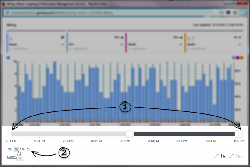
| 1. Adjust the viewing area of the graph, based on time. | Use the Time Range Slider to focus the graph on specific time intervals throughout the day, or to adjust the amount of data (a short time interval or a long one) that displays in the graph. You can use the Time Interval buttons (2) to more precisely adjust the length of the Time Range Slider, as well. For more information, see Select a precise time interval for the graph and Using the Time Range Slider to Select Data to Display in the Metric Graphing Window. |
|
2. Select a precise time interval for the graph. |
Use the Time Interval buttons to quickly adjust the amount of data to view in the graph. The values that display on the Time Interval buttons are dependent on parameters that the administrator configures. For example, if you have a 30m Time Interval button, and you click it, then the application displays a graph of the data that it collected during the previous 30 minutes – the left side of the graph is the historical 30-minute mark, and the right side of the graph is the current moment in time. |
Arrange Metrics and Modify Color Selections
| 1. and 2. Editing the color and placement of metrics. | A break in the horizontal line at the top of the Metric Graphing window (1) indicates there there are metrics aligned to both the left and right vertical axes of the graph. The metrics that are aligned to the left vertical axis display before the line break. The remaining metrics are aligned to the right vertical axis. Click and drag the handle ( Click anywhere on a metric tile to open the drop-down menu from which you can edit the graph style of that specific metric, or change the color of the metric, or even hide the metric on the graph (click the blank color square ( |
| 3. Reading metric values from the correct graph axis. | Color swatches over an axis identify the metrics that are aligned to that axis. If you have metrics aligned to both the left and right vertical axis, check the color swatches to ensure you are reading the values for a specific metric from the correct axis. |
Graphing Multiple Time Profiles for a Historical Metric
Using the list of available metrics under the Metrics toggle, select a historical metric that has multiple time profiles configured. Select that same metric for each of the time profiles. For example, you can choose the following metrics to display in a single graph:
- [ ] AHT Short
- [ ] AHT Medium
- [ ] AHT Long
When choosing multiple time profiles of a metric to graph, keep in mind that each combination of metric plus time profile is counted. In the following example, three metrics are selected for graphing:
- [x] AHT Short
- [x] AHT Medium
- [ ] AHT Long
- [ ] ASA Short
- [ ] ASA Medium
- [x] ASA Long


