
Extended Views
You can expand the Engagement Summary Today and Web Traffic Today widgets to display dedicated dashboards that contain their own sets of widgets.
Just click the three vertically placed dots in the upper-right corner of your widget and select "Expand to Tab":

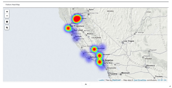
The resulting dashboards give you creative new ways of looking at the information displayed by the widgets from which they are accessed. For example, here is a heat map based on your daily traffic information, showing where your visitors are located:
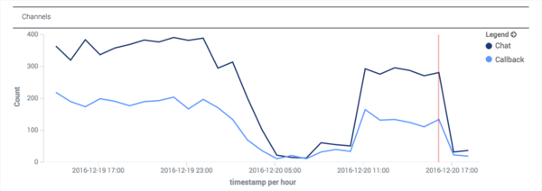
And a trendline from your Engagement Summary dashboard showing which channels have been offered over a period of a bit more than a day:
The next section discusses how to change this time frame to just about anything you might want.
Extended View Time Filter
The Engagement Summary Today and Web Traffic Today Extended Views include a time filter that you can use to restrict your data to a specific time frame. You can access this filter by clicking in the upper right corner of your dashboard.

You can configure the time filter configure in three different ways, as shown in the next three sections.
When you are finished, you can hide the time filter menu by clicking the chevron button on the bottom—or just click again on the time frame in the top right corner.
Quick Filter
This menu lets you choose from a variety of commonly requested time frames. By default, the time frame is set to Today.

Relative
With this one, you can decide how far back you want to start your filtering, capturing all of the data from that starting point to the present moment.

Absolute
This menu lets you select an absolute starting point and an absolute ending point for your data.

Refresh Rate
The default refresh rate is set to 30 seconds and can be changed, paused, or started using a menu that is displayed when you click on the current refresh rate.

You can set your refresh rate to 5 seconds or to an entire day.

Zooming In
You can click and drag to select a portion of a timeline. When you do this, the timeline expands so that you can focus on the time frame that you selected:

After zooming, the data will look like this:

Filtering
Widget-Based Filtering
You can also click many different items in the extended view, such as bars, circles, dots, lines, chart layers—give it a try! When you do, the dashboard creates a new filter that you can apply to the data that comes into the dashboard.
The curved arrow in the lower left of the following figure is pointing to the google.com section of the Top 5 Origins bar widget. If you click that section, you will filter out the other origins.

In the next figure, you can see that the Top 5 Origins widget (1) is only showing google.com, meaning that we are only picking up hits from people who arrived at our site from google.com. Notice also that a green filter icon has been added in the upper left of the image (2), which confirms this.

Since all of the Google-based traffic originates in the Las Vegas area, let's zoom in by clicking the plus sign in the upper left corner. The arrow in the bottom of the screenshot is pointing to one of the Top 5 Languages, es-Mx, which is Mexican Spanish.

By clicking on the es-Mx bar, you can filter out everyone who is using a language other than Mexican Spanish, as shown in the screenshot below. We now have two green filter icons in the upper left, and there is only one bar in the Top 5 Languages widget.

When you hover over a green filter, four new options appear, allowing you to:
- Disable the filter or re-enable it
- Pin or unpin it
- Include or exclude it
- Remove the filter
In the following graphic, which comes from a different session, we are hovering over the google.com filter. This displays icons that allow us to apply any of the four options to that filter.

We have disabled the google.com filter by clicking on the round-cornered rectangle:

Coming back to the current session, let's see what happens when we exclude Mexican Spanish. Note that:
- The es-Mx filter is now red.
- We are showing traffic in all languages except Mexican Spanish.

Filtering by Geographical Coordinates
You can use the Rectangle tool to restrict heat map values to just the part of your map that you want to focus on. Click the dark rectangle icon (1). Then click and drag on the desired section of the map (2):

Here's the result. Note that the values for downtown Las Vegas are filtered out, even though that area is still displayed on the map:

Combining Filters
As we showed you in the previous diagram, you can combine geographical filtering with other types of filtering. In that diagram, we have filtered our results in three ways:
- By origin
- By language
- By geographical coordinates