Contents
Styling the Widgets
Themes
You can change the appearance of Genesys Widgets using themes. Themes allow you to change colors and fonts for all widgets.
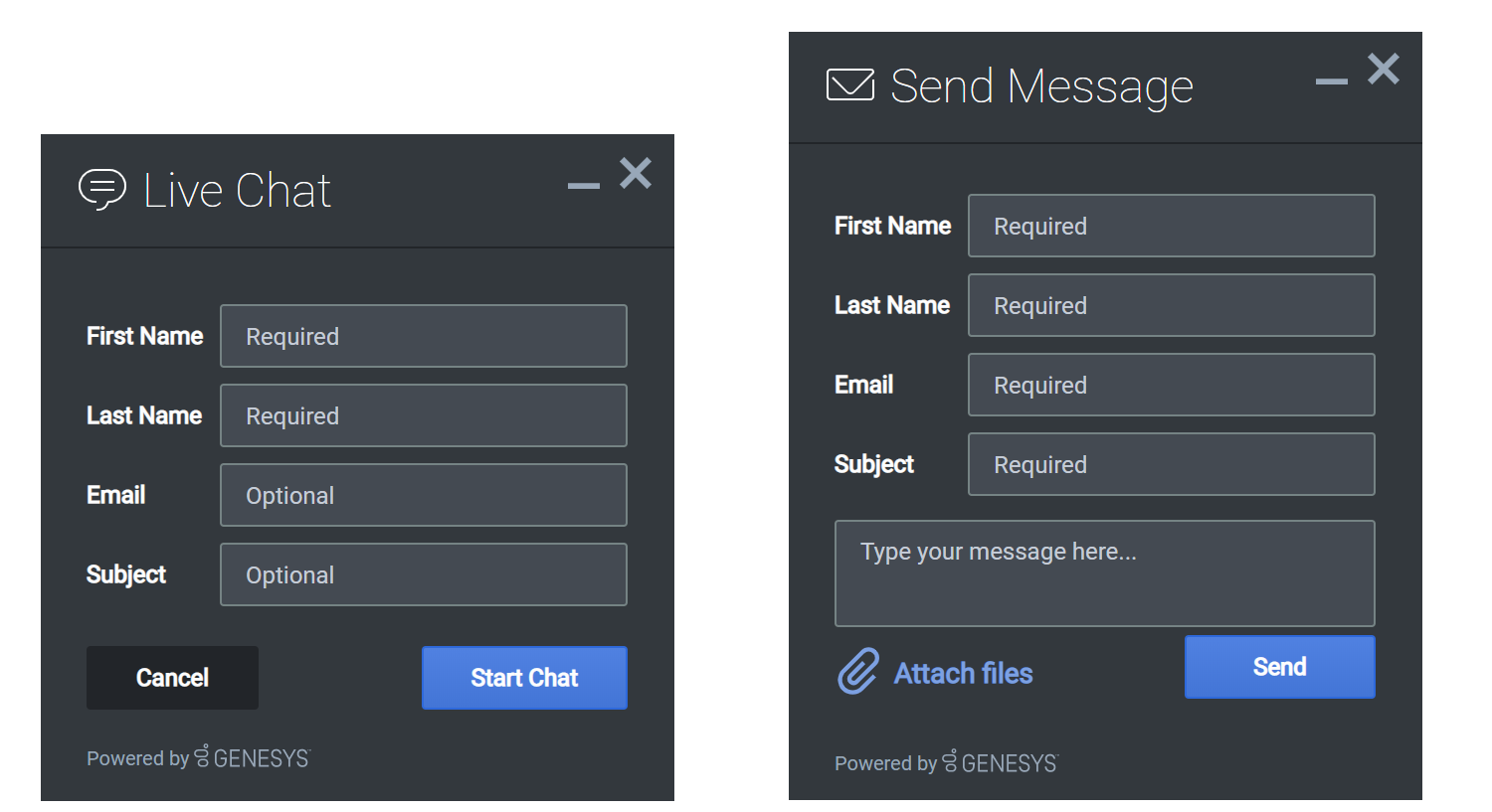
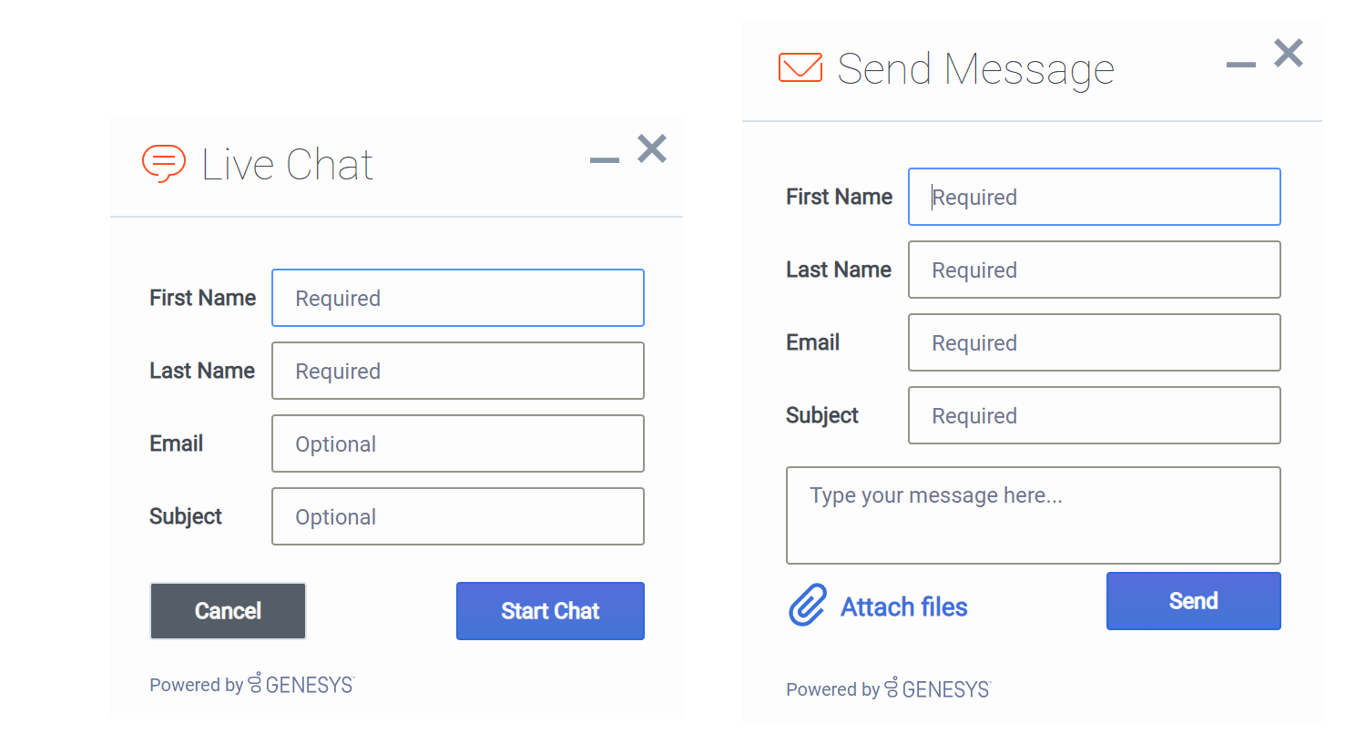
Genesys Widgets includes two built-in themes, "dark" and "light". The "dark" theme is active by default.
Dark Theme
Light Theme
How do I set the active theme?
There are two methods for setting the active theme:
Configuration
window._genesys.widgets.main.theme = "light"; // or "dark"Widget Bus Command
window._genesys.widgets.bus.command("App.setTheme", {theme: "light"}); // or "dark"
How do I create my own themes?
Theme Templates
Genesys Widgets uses special LESS files called "Theme Templates" to define themes. Using this Theme Template, you can modify the color palette and add new styles. Everything is laid out clearly in the template file.
LESS syntax is used because we can define local variables that allow us to create a clear color palette. The LESS file color palette consists of no less than 28 separate color variables. These are grouped by their usage:
- Background Colors
- Text Colors
- Icon Colors
- Border Colors
- Outline Colors
At a bare minimum, you can create a new style by simply changing the color values in the color palette. You may add or remove colors from this palette as you see fit.
Color Palette Example
/* Color Palette */
@bg_color_1: 		#33383D; // Main Background Color
@bg_color_2: 		#444A52; // Form Inputs
@bg_color_3: 		#222529; // Button default
@bg_color_4:		#5081E1; // Button primary gradient 1
@bg_color_5:		#4375D6; // Button primary gradient 2
@bg_color_6:		#CCCCCC; // Button disabled
@bg_color_7:		#212529; // Native scrollbar track color
@bg_color_8:		#A3A8AE; // Scrollbar color

@txt_color_1: 		#FDFDFD; // Main text color
@txt_color_2: 		#98A7B8; // footer text
@txt_color_3: 		#FDFDFD; // Button default & primary / autocomplete text hover color
@txt_color_4: 		#FDFDFD; // Hyperlink color
@txt_color_5:		#C5CCD6; // Placeholder color
@txt_color_6:		#F53131; // Alert/error color

@icon_color_1:		#FDFDFD; // Base icon color
@icon_color_2:		#8C8C8C; // Secondary icon color (multitone only)
@icon_color_3:		#000000; // Icon shadow color (multitone only)
@icon_color_4:		#000000; // Icon secondary shadow color (multitone only)
@icon_color_5:		#98A7B8; // Window control icon color
@icon_color_6:		#98A7B8; // Form input icon overlay color (e.g. "clear" icon)
@icon_color_7: 		#5081E1; // Interactive icon color 1 (attach files, delete file, etc)
@icon_color_8: 		#4AC764; // Positive Color (confirmation, availability, usually green)
@icon_color_9: 		#F53131; // Negative Color (error, exception, usually red)
@icon_color_10: 	#F8A740; // Warning Color (warning, pending, offline, usually yellow or orange)
@icon_color_11: 	#FDFDFD; // Icon color for primary buttons

@border_color_1: 	#222529; // Main border color
@border_color_2:	#2E69DB; // Button primary
@border_color_3:	transparent; // Button default
@border_color_4:	transparent; // Button disabled
@border_color_5:	#F53131; // Alert/error color
@border_color_6: 	#758384; // Form controls default state

@outline_color_1: 	#75A8FF; // Form input focus outline / autocomplete hover background color
@outline_color_2: 	#DAE6FC; // Outline color for primary buttons
Example Theme Template Files
Note: Clicking the example template files automatically downloads them to your computer.
theme-template-dark.less
theme-template-light.less
Theme Templates are LESS files, which must be converted to CSS before being used on a website. Use a website or tool to convert them when you're ready to test and implement them on your site.
By default, the Theme Template will override styles for all Genesys Widgets generally, but you may add more specific changes that affect only a specific widget. More information on this is provided later on this page.
Naming Your Theme
In the "dark" theme template file, the first class selector is defined as:
.cx-widget.cx-theme-dark
.cx-widget is the base class for all Genesys Widget UI. The outermost container of every widget or standalone UI element has this class and is used to identify UI elements that belong to Genesys Widgets.
.cx-theme-dark is the class name created for the "dark" theme. Themes are applied by searching for all elements with the .cx-widget class and appending the theme's classname to it. Thus, the combined class selector indicates styles that will be applied only when your custom theme is active in the configuration object.
You may name your theme classname anything you wish. There are no restrictions or limitations.
In a later step, you will register this theme classname in your configuration.
Customization Guidelines
When creating your own themes, they are restricted to the following CSS properties:
- color
- background
- font-family
- font-style
- border-color
- border-style
- and other non-structural properties
How do I register my themes with Genesys Widgets?
You can register themes in the Genesys Widgets configuration.
window._genesys.widgets.main.themes = {

    "blue": "cx-theme-blue"
};
The name:value pair used here consists of a key ("blue") and the theme's CSS classname ("cx-theme-blue").
You can add as many themes to this list as you need and select the active theme using one of the key values.
window._genesys.widgets.main.theme = "blue";

// OR

window._genesys.widgets.bus.command("App.setTheme", {theme: "blue"});
How do I change styles for a specific widget?
It is possible to specify specific widgets and even specific elements within a widget by appending the widget's CSS classname to the theme classname.
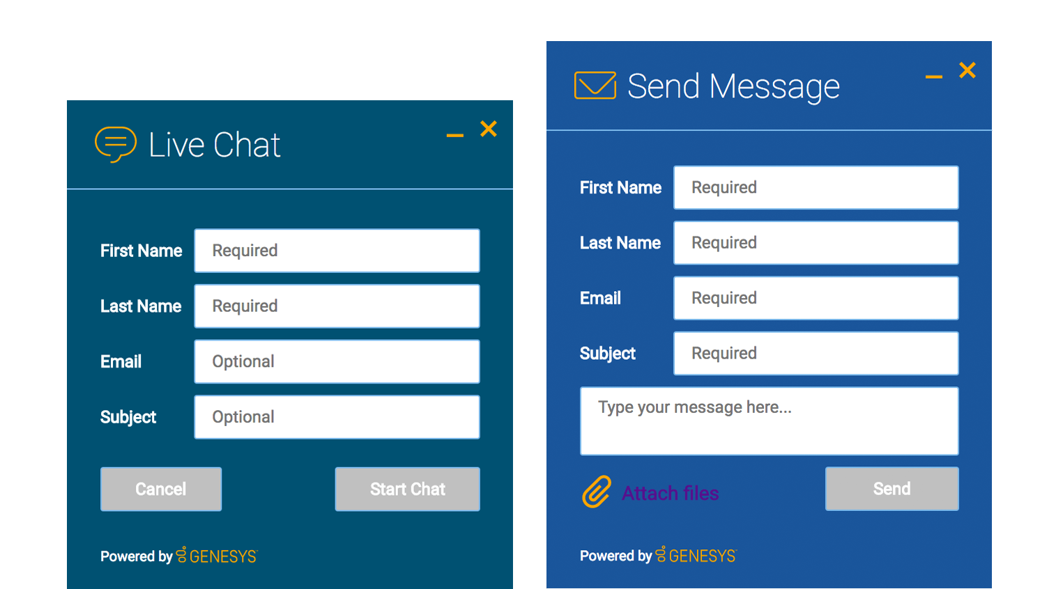
In the following example, we extend the "cx-theme-blue" class with a widget-specific entry that makes the WebChat widget's background color a darker shade.
.cx-widget.cx-theme-blue, .cx-widget .cx-container{

    color: #FDFDFD;
    background: #1e5799;
}

.cx-widget.cx-theme-blue *{

    border-color: #7DB9E8;
}

.cx-widget.cx-theme-blue.cx-webchat, .cx-widget.cx-theme-blue .cx-webchat{

    background: #225897;
}
Widget-Specific and Element-Specific
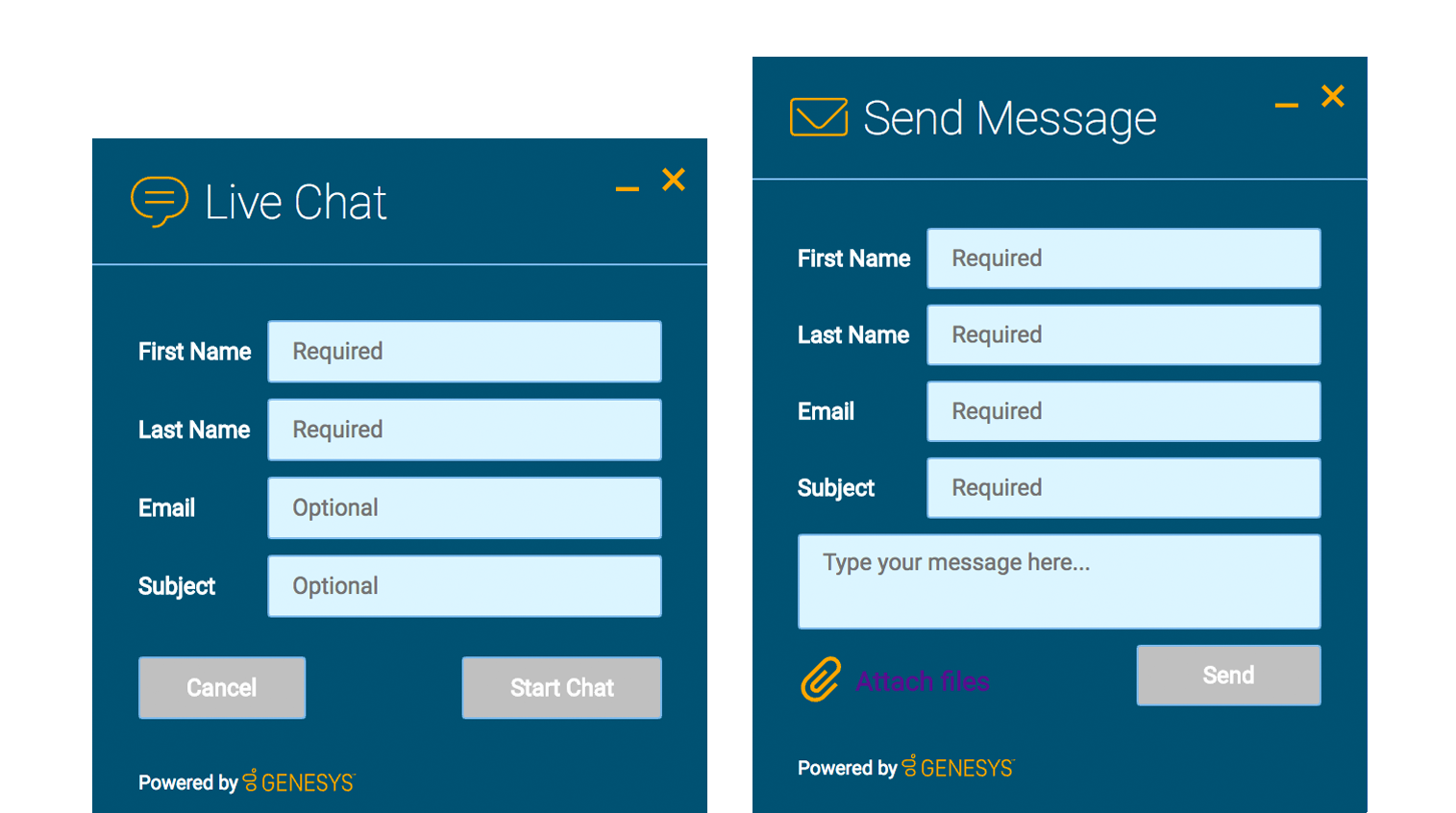
In the next example, we further extend the "cx-theme-blue" class with a widget and element-specific entry that changes the background color of the input fields within the WebChat widget to a light shade of blue.
.cx-widget.cx-theme-blue, .cx-widget .cx-container{

    color: #FDFDFD;
    background: #1e5799;
}

.cx-widget.cx-theme-blue *{

    border-color: #7DB9E8;
}

.cx-widget.cx-theme-blue.cx-webchat, .cx-widget.cx-theme-blue .cx-webchat{

    background: #225897; // Darker Shade
}

.cx-widget.cx-theme-blue.cx-webchat .form input, .cx-widget.cx-theme-blue .cx-webchat .form input{

    background: #DCF5FF; // Lighter Shade
}
How do I change the layout and structure of widgets?
Genesys Widgets only support customizing a limited set of styles through themes. If you wish to use an alternate layout of your own design, you can disable the widget you want to replace and utilize the provided service plugins to build your own.
Choosing Which Plugins to Load
Refer to the 'plugins' configuration option here: App Configuration
Service Plugins
Service plugins provide a high-level API for quickly integrating a UI with back-end services. Each widget is matched with a corresponding service plugin. This separation allows for advanced integrations.
How do I change fonts?
By default, Genesys Widgets downloads and uses the Google font 'Roboto'. You can change the font used in Genesys Widgets by using the following CSS:
.cx-widget{ font-family: name-of-font-here; }
Choose whichever font you wish to use and it will then apply throughout Genesys Widgets.
Disabling Google Font Download
If you would like to prevent the Roboto font file from being downloaded at startup, you can disable the download by changing the configuration option main.downloadGoogleFont to false:
_genesys.widgets.main.downloadGoogleFont = false;
If set to "false", the Google font 'Roboto' will not be downloaded. If set to "true", the Google font 'Roboto' will be downloaded. The default value is "true".


