Contents
- 1 FAQs Related to Dashboard Use
- 1.1 Working with metrics
- 1.2 Working with dashboard tools
- 1.3 Working with the accessible dashboard
- 1.4 How do I view metrics specific to a time profile group or type of interaction?
- 1.5 Can I add metrics to my dashboard display or remove metrics?
- 1.6 Where can I find information about a metric?
- 1.7 Can I change the order in which metrics display in the dashboard?
- 1.8 Why do some metrics display a value of N/A?
- 1.9 Which keyboard shortcuts can I use with the accessible dashboard?
- 1.10 Can I change the order in which data displays in the panes?
- 1.11 How does Search work in the Team pane?
- 1.12 How do I locate information about a specific agent team?
- 1.13 Is it okay to open multiple Frontline Advisor dashboard sessions?
- 1.14 When did my dashboard last update the information and can I stop the updates?
- 1.15 Can I adjust the size of the panes in my dashboard?
- 1.16 Can I adjust column width?
FAQs Related to Dashboard Use
There are many ways in which you can customize your Frontline Advisor dashboard to optimize views, analyze data, or focus on key metrics. This page describes how to use the Frontline Advisor dashboard for these everyday tasks.
Working with metrics
The following topics provide information to get you started working with metrics in the Frontline Advisor dashboard:
- How do I view metrics specific to a time profile group or type of interaction?
- Can I add metrics to my dashboard display or remove metrics?
- Where can I find information about a metric?
- Can I change the order in which metrics display in the dashboard?
- Why do some metrics display a value of N/A?
Working with dashboard tools
The following topics provide information about features that help you to find, display, and better analyze specific data in the dashboard panes:
- Can I change the order in which data displays in the panes?
- How does Search work in the Team pane?
- How do I locate information about a specific agent team?
- Is it okay to open multiple Frontline Advisor dashboard sessions?
- When did my dashboard last update the information and can I stop the updates?
- Can I adjust the size of the panes in my dashboard?
- Can I adjust column width?
Working with the accessible dashboard
The following topic provides a list of keyboard shortcuts that you can use with the accessible dashboard:
How do I view metrics specific to a time profile group or type of interaction?
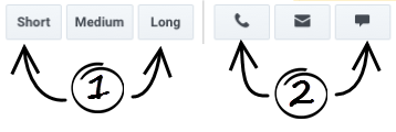
You can filter the dashboard display by time profile group and/or by channel (voice, email, or chat interactions). The filters are available in the toolbar at the top of your dashboard. Depending on your role, and on the time profile groups and channels used in your Contact Center, you might not see all of the filters shown in the Figure.
- Time Profile Group
Configured time profile groups are available as clickable buttons. Use these buttons to filter the information in the dashboard by time profile group (Short, Medium, and Long). The following values are the default values for the time profile groups:- 5 minutes/Sliding for a Short group
- 30 minutes/Growing for a Medium group
- 24 hours/Growing for a Long group
- Channels
Available channels display as clickable buttons. Channels are the methods that agents use to communicate with customers (for example, telephone (also referred to as voice), email, and chat). Use these buttons to filter information in the dashboard by channel. For example, if you want to see metrics related only to email interactions, then click the Email channel button.
Can I add metrics to my dashboard display or remove metrics?
If you see the Column Chooser button (link=) in the Frontline Advisor toolbar, then you can choose which metrics to display in your dashboard, and which to hide. For example, your selection of dashboard metrics might be based on the particular aspects of team and agent performance that are most relevant in order to meet specific operational targets. Access to the Column Chooser is tied to user roles. In some enterprises, a manager or system administrator will select the metrics for you, in which case you will not have the Column Chooser button.
If you have the Column Chooser button (link=) in the toolbar, click it to open the Column Chooser window. In this window, you make choices about which metrics to display in your dashboard. Genesys recommends that you minimize the number of metrics that you actively watch in your dashboard; show only a few key metrics at a time. Too many metrics means too much information to process. Focus on specific goals for your teams and track metrics that are specific to those goals.
In the Column Chooser window, use the Select drop−down list to choose which set of metrics to display in the Selected Metrics pane. Metrics in the Selected Metrics pane display in your dashboard. You can add metrics to, or remove metrics from, this initial list.
Any metric in the Available Metrics pane is available for display, but is not currently displayed in the dashboard. To add an available metric to your dashboard display, place a check mark beside the metric in the Available Metrics pane. When you click Apply, that metric will be moved to the Selected Metrics list and will be added to your dashboard display.
To help you narrow your search for a specific metric in the Available Metrics pane, use the filters at the top of the pane, or enter some or all of the metric name in the Search field.
To remove a metric from your dashboard, you simply remove the check mark from that metric row in the Selected Metrics pane. When you click Apply, that metric will be moved to the Available Metrics pane and removed from your dashboard.
Where can I find information about a metric?
Metric descriptions are contained in tooltips in your dashboard. To display tooltips, hover your cursor over any metric column heading. The tooltip contains the metric display name, the channel, the time profile group, and a description of the metric. Genesys also provides a Pulse Advisors Metrics Reference Guide.
Can I change the order in which metrics display in the dashboard?
As you work with the Frontline Advisor dashboard, you might find that some metrics are more helpful than others. If you continually scroll back and forth in the Hierarchy or Team pane to find certain specific metrics, then consider moving those metrics into view in the dashboard panes. You can change the order in which the metrics display by dragging a column heading to another location. The only exception is the Agent Name column. If you have this column in your Team pane, you cannot move it.
Why do some metrics display a value of N/A?
You might see "N/A" or dashes displayed for some metrics in your dashboard, rather than numeric values. N/A indicates one of the following:
- data is temporarily unavailable for that metric
- the number of logged-in agents is less than the "minimum agent count" set for the team, which is a global system setting that is not specific to Advisors modules
A dash (-) means that the data is never available for that metric for the group or agent. This does not necessarily indicate a problem; it could be related to data source limitations.
Which keyboard shortcuts can I use with the accessible dashboard?
Keyboard shortcuts can be used in conjunction with screen reader accessibility software, as an alternative to the standard browser navigation. Frontline Advisor supports JAWS Standard software. You can use the following keyboard shortcuts in the Frontline Advisor accessible dashboard.
| Shortcut | Accessibility Function |
|---|---|
| T | Jumps to the Frontline Advisor Hierarchy pane table. |
| CTRL + ALT + NumPad5 | Reads the row and column coordinates, followed by the cell contents, then the appropriate row and column headings. |
| CTRL + ALT + Right Arrow | Moves one cell to the right in the same row. |
| CTRL + ALT + Left Arrow | Moves one cell to the left in the same row. |
| CTRL + ALT + Up Arrow | Moves one cell up in the same column. |
| CTRL + ALT + Down Arrow | Moves one cell down in the same column. |
| CTRL + ALT + Home Arrow | Moves to the first cell in the current table. |
| CTRL + ALT + End Arrow | Moves to the last cell in the current table. |
| B | Exit (close) the accessibility interface. |
Can I change the order in which data displays in the panes?
The ability to sort information in the dashboard panes is controlled by user roles; you can sort information within the panes only if your role includes the privilege to do so. Assuming your role includes this privilege, you can sort the data in any column of the Team and Team Alerts panes by clicking the column heading. For example, sorting the Average Wrap Time column gives you a quick view of the agents with the longest or shortest average wrap times. A blue line displays below a column heading to indicate that you have sorted the data in that pane based on that column.
The Hierarchy pane must retain its tree structure (groups within groups), so sorting is not available in this pane.
The order in which data is sorted is retained even if you log out. When you next log in, data in the columns is sorted based on the order that you last selected in your previous session.
If your role does not allow you to sort data, or if you have never changed the order in which data is sorted in columns, then the default sorting is used. See Team Pane and Team Alerts Pane for more information about the default data sorting in each pane.
See also Can I change the order in which metrics display in the dashboard?
How does Search work in the Team pane?
You can use the Search field above the Team pane to filter the information that is displayed in the pane. For example, assume you added the Agent Skills metric column to your Team pane. You can enter a skill name in the Search field at the top of the Team pane; enter the full skill name or only part of the name. The Team pane will display only agents whose skills include the search string that you entered.
How do I locate information about a specific agent team?
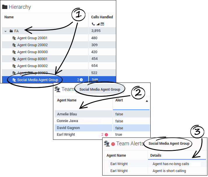
To monitor a specific team of agents, navigate the Hierarchy pane until you find the agent team (1). Agent teams are marked with an agent team icon (![]() ). Once you select an agent team in the Hierarchy pane, the Team pane displays the list of agents who are members of that team, as well as the activity of individual agents (2). If there is at least one agent on the selected agent team whose activity is generating a rule-related alert, then details of each alert display in the Team Alerts pane, including the names of the agents who are triggering the alerts and which rules are affected (3).
). Once you select an agent team in the Hierarchy pane, the Team pane displays the list of agents who are members of that team, as well as the activity of individual agents (2). If there is at least one agent on the selected agent team whose activity is generating a rule-related alert, then details of each alert display in the Team Alerts pane, including the names of the agents who are triggering the alerts and which rules are affected (3).
You can also search for a team (or other group) by entering a name in the Search field above the Hierarchy pane. The Search function acts like a filter for the dashboard; the Hierarchy pane is cleared of all nodes (that is, groups) except those that match the search criteria. The search is limited to the hierarchy nodes that are listed in your Hierarchy pane and will not return results for group or team names that you do not normally see in your monitoring hierarchy.
For a description of the Frontline Advisor dashboard panes, see Get to Know the Frontline Advisor Dashboard.
See also How do I view metrics specific to a time profile group or type of interaction?Is it okay to open multiple Frontline Advisor dashboard sessions?
You can open the Pulse Advisors modules in Microsoft Internet Explorer, Google Chrome, or Mozilla Firefox. It is okay to open multiple sessions of Advisors simultaneously. For example, you might want to have two Frontline Advisor sessions running simultaneously, or you might open the Administration module in one browser window and the Frontline Advisor dashboard in another window.
The Advisors dashboards work like any other browser window; you can right-click an Advisors module name in the navigation bar and choose to open that module in a new tab or window.
When did my dashboard last update the information and can I stop the updates?
The Frontline Advisor dashboard receives updated information automatically, based on a configured time interval. You might be responsible for configuring that time interval, or someone on the system administration team in your enterprise might configure it for you.
1. Pause the Dashboard
You can pause the dashboard if you want to temporarily halt the automatic data updates. For example, you might want to analyze data in detail, or discuss some aspect of the information currently in your dashboard with a colleague. The Data Connection status indicator (3) changes to yellow status (![]() ) when you pause the dashboard; this is normal behavior. To resume the dynamic data display, click the Play button
) when you pause the dashboard; this is normal behavior. To resume the dynamic data display, click the Play button ![]() . The Data Connection status indicator changes to green (
. The Data Connection status indicator changes to green (![]() ), and the real-time updates resume.
), and the real-time updates resume.
2. Timestamp
Under normal circumstances, the Frontline Advisor dashboard receives data at regular intervals. However, if there is no new data to display, the timestamp at the top of your dashboard does not change. Check the timestamp to determine when updated data was last received. If the timestamp fails to update in a very long time, you should talk to your system administrator. He or she will check to make sure that the source of the data is functioning correctly.
3. Data Connection status indicator
The status indicator changes color when you click the Pause button, or when there is a problem with connectivity. The indicator can be green, yellow, or red. It will turn yellow, for example, if you pause the dashboard. If the indicator is red (![]() ), report it to your system administrator. Red indicates that Frontline Advisor is no longer receiving data.
), report it to your system administrator. Red indicates that Frontline Advisor is no longer receiving data.
Can I adjust the size of the panes in my dashboard?
You can manually resize the height and width of each pane in your dashboard. Move your cursor over the space between two panes until you see the split bar symbol (![]() ), and then click and drag.
), and then click and drag.
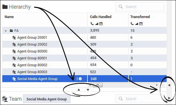
To quickly hide a pane in order to enlarge another, use the collapse/expand arrows that are available between panes.
Can I adjust column width?
You can adjust the width of individual columns in your dashboard panes by dragging the cursor when it changes to a split bar (![]() ) near a column break. There is a default minimum width for columns; once you reach the minimum width, then you can only enlarge the column.
) near a column break. There is a default minimum width for columns; once you reach the minimum width, then you can only enlarge the column.
If you add one or more columns to your dashboard using the Column Chooser, the width of the columns adjusts automatically.


