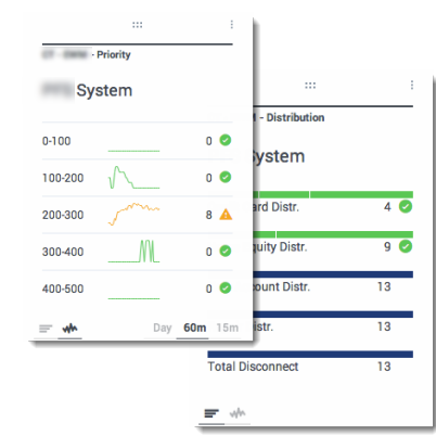
How do I choose a Widget type?
The widgets on the Genesys Pulse dashboard display charts that provide an at-a-glance view of what is happening in your contact center. The best way to choose a widget type is to preview the widget when you add a new widget. This allows you to see which widget type best displays what you want to see in your report.
Contents
What do I see in a Donut widget?
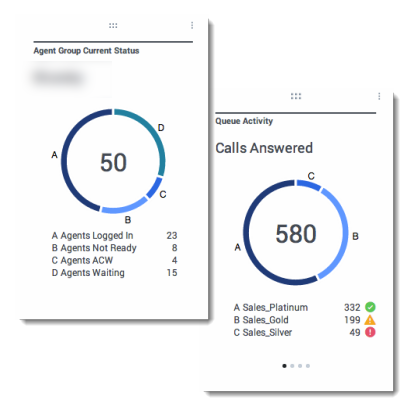
A Donut chart shows a proportional representation of the parts of a whole sample, similar to a pie chart.
The Donut widget displays either:
- one statistic for four specific objects
- one statistic for three top objects and a sum the remaining objects
- one object with the values of four defined statistics
Depending on the reference selected in the Cycle By option, a carousel can be defined to display additional several items.
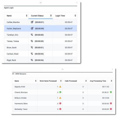
What do I see in a Grid widget?
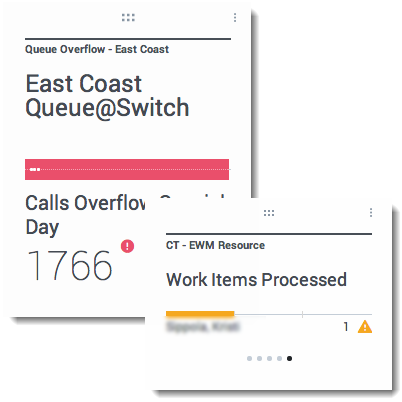
What do I see in a KPI widget?
Note: The maximum value for the bar charts in KPI widgets is the maximum value of all the objects selected for the statistic in this widget or maximum value of the alert configured for this widget.
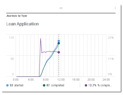
What do I see in a Line Chart widget?
What do I see in a List widget?
Note: The maximum value for the bar charts in List widgets is the maximum value of all the objects selected for the statistic in this widget or maximum value of the alert configured for this widget.

