Using the Pulse Plugin
Overview
Genesys Knowledge Center Plugin for Pulse plugin allows you to add knowledge-centric statistics to your existing dashboards.
Plugin provides 2 widgets:
- Dashboard: containing a set of pre–configured statistics that are embedded into the main pulse dashboards along with other measures of your environment.
- Expanded: Kibana-based widget that allows dynamic data discovery when you expand the widget.
To add widgets to your pulse dashboard please follow the steps described in the Deployment Guide.
Dashboard widget
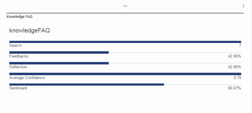
The Dashboard Widget provides a small component with major knowledge KPI that is embedded into the pulse dashboard along with other environment metrics and statistics. The Widget shows the information for a particular knowledge base within a specified period of time from now. KPIs shown on the widget are:
- Search – number of search requests executed
- Feedbacks - % of the search request that users provided feedback on
- Deflection- % of the search queries that end up with indication that no answer had been found
- Average Confidence – average confidence of the first documents returned on the search requests
- Sentiment - % of ‘like’ feedback
Expanded widgets
When you expand the Knowledge Center dashboard Widget to the full tab mode you will see either the Analytics Expanded Widget or the Performance Expanded Widget, enabling data discovery and analysis within your cluster. The Widgets are based on Kibana and deliver all of Kibana's power for data analysis.
Analytics Widget
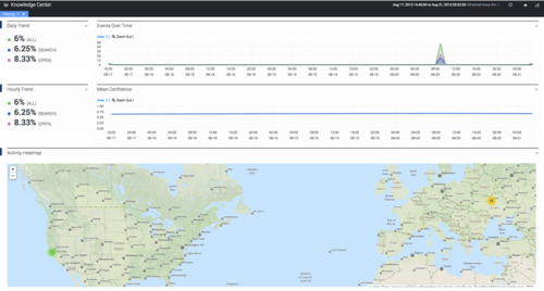
The goal of the Analytics Widget, intended for use by supervisors and content managers, is to help you visualize how data is used in the enterprise by focusing on the most frequently used content and questions that fail to yield an answer. This widget can also be used to analyze data within a particular knowledge base, language, or location.
Let's see what each part of the dashboard means:
- The timeline, which includes a histogram, enabling you to monitor the daily trend of knowledge requests that you can then sort by type over a selected period of time. Note: If you select a period of time that is less than one day, the trend will not be displayed. If you would like to look at a specific trend you can select it on the histogram and the widget will adjust to display the specific activity that occurred over the selected time frame.
- The confidence panel displays knowledge event trends for the last hour of a selected time period while the histogram shows the mean confidences for the answers that came back to users first.
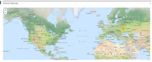
- The world map in the geography panel is covered with heat maps that demonstrate requests based on location. Note: You can click heat points to zoom into particular regions more closely.
- The analytics panel depicts a distribution of events that can be sorted by type, knowledge base, language, origin (an agent vs a customer), sentiment (percentage of positive and negative likes) and country. Note: You can click a category to zoom into a particular segment of events.
- Use this counter panel to visualize the most significant requests for:
- search - quantity of search requests
- viewed - quantity of knowledge articles opened by users
- no answer - quantity of queries the system captured for which there was no answer
- positive and negative - the amount of positive/negative feedback left by users
- comment - quantity of comments left by users
- The trend panel enables you to analyze customer queries for the top ten most:
- viewed documents
- viewed categories
- liked documents
- used keywords
By default the dashboard is collapsed, but it can be expanded to see the details of each event:
Performance Widget
The Performance Widget, intended for use by administrators, focuses on the mean processing times for user requests based on their distribution between servers, knowledge bases, and location.
Let's take a look at each part of the dashboard:
- The timeline, which includes a histogram, enables you to monitor the daily trend of knowledge requests that you can then sorted by type over a selected period of time. Note: If you select a period of time that is less than one day, the trend will not be displayed. Also, if you would like to look at a specific trend you can select it on the histogram and the widget will adjust to display the specific activity that occurred over the selected time frame.
- The processing time panel displays the mean processing times of agent and customer requests over a selected period as well as an accompanying histogram.
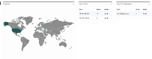
- The world map in the geography panel is covered in heat maps depicting requests based on location as well as the top 10 IP addresses of the customers who are creating those queries.
- The analytics panel displays a distribution of events that can be sorted by type, knowledge base, language, origin (an agent vs a customer) and country. Note: You can click a category to zoom into a particular segment of events.
- The default mode of the Performance Widget displays a collapsed version that can be expanded to see the details of any event:
Widget Time Frame Display
The following panels, found in both the Analytics Widget and the Performance Widget, can be used to filter the appearance of your data.
- The display above, found on top of the dashboard, contains filters that can be used to modify your current data to:
- view active filters (the filter can be removed by pressing the X or temporarily deactivated after deselecting the box)
- refresh data
- use the home button to reset the dashboard to its default settings
- select time frames for the menu


