Migrate Custom Applications from 8.1 to 8.5
If you want to highlight the functional areas in the Workspace UI with the red boxes and descriptions shown in the screen shots in this topic, on a non-production developer workstation, configure the value of the keyboard.shortcut.action.test hidden developer option to a keyboard short cut, such as: Ctrl+P. When you press the keyboard shortcut, the functional areas are highlighted.
Contents
Migrate an existing 8.1.x Project
Before you start migrating your custom code, you must update Microsoft Visual Studio:
- Download and install the latest update of Microsoft Visual Studio 2012.
- Open the solution file of your 8.1 customization from Microsoft Visual Studio 2012.
- If Visual Studio 2012 suggests that you migrate your project, you must follow the Microsoft Visual Studio 2012 migration wizard.
Some XAML Tags
Some XAML tags used for isolated strings and localization can generate compilation errors. To avoid this issue, you must find all XAML tags with this kind of attribute format:
<MenuItem>
     ...
     Header="{loc:Translate Uid=Menu.MyBigMenu, Default=My Menu}"
     ...
</MenuItem>
And replace the formatting as follows:
<MenuItem>
     ...
     loc:Translate.Uid="Menu.MyBigMenu"
     Header="{loc:Translate Default=My Menu}"
     ...
</MenuItem>
Project References
Microsoft Visual Studio 2012 (using .NET 4.5) is not as permissive with Project references as Microsoft Visual Studio 2008 (using NET 3.5). If your code includes using directives for a namespace implemented in a separate assembly, you must now add a reference to this assembly to the project's reference list.
Changes in the Main Window Regions
The 8.5.0 UI design reorganizes the regions that are contained in the Main Window.
Area ToolbarWorksheetButtonRegion
The ToolbarWorksheetButtonRegion area no longer includes Workspace, Workbins, Contact, and Messages buttons and the associated out-of-the-box functions.
Now, the ToolbarWorksheetButtonRegion area is empty by default and you can still include Custom Modules and Views in this region. Custom modules can no longer extend the drop-down menus of the former Workspace button through the WorkspaceMenuRegion region. Instead, you should use the ToolbarHamburgerButtonRegion area to add menu items in the hamburger menu along with the out of the box items of this area, such as My Channels, My Campaigns, and so on.
Area ToolbarWorksheetRegion
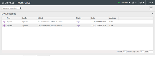
The ToolbarWorksheetRegion region no longer includes the 'ToolbarStatusRegion' and 'MyMessageRegion' regions. The Message View was moved to the ToolbarWorksheetRegion region.
Area ToolbarInteractionBarRegion
The ToolbarInteractionBarRegion region is relocated between the ToolbarDialerRegion and ToolbarWorksheetButton regions.
Area CustomToolBarRegion
The CustomToolBarRegion region is a new SortableItemsControl region available on the left side of the Agent Status.
The New Interaction Presentation Model
In 8.5.0, the Interaction Window View is replaced with pinned and floating interaction views.
Pinned Interaction View
The CaseView root container of the Pinned Interaction View includes the same regions and views than the CasesRegion root container of the 8.1 Interaction Window View. If your customization requires the CasesRegion root container (not displayed in Pinned mode), Genesys recommends that you work in the legacy interaction window presentation mode.
Floating Interaction View
The Region structure of the Floating Interaction View is a subset of the Pinned Interaction View described above:
- Its root container is CaseView
- The CaseViewSideButtonRegion and InteractionWorksheetRegion regions and all the cascading material that they contain are not instantiated
- This mode displays the left part of the Interaction View
- The CaseViewSideButtonRegion region is replaced with the new CaseViewPopupSideButtonRegion region which enables you to insert side buttons in floating mode
If you implement side buttons in CaseViewPopupSideButtonRegion region, your custom code must trigger a programmatic switch to display the associated views when the buttons are clicked. You can do this by calling the following method:
IManagerInteractionContainer.ShowCaseViewInMainToolBar(<case_id>, <side_view_name>);New Theme
Inheriting Theme's Style
You can use named styles in your XAML code to render the common controls (such as Buttons, Textbox, Textblock, Scrollbar, and so on) which are used in custom views in the same way as the out-of-the-box views.
See also Configure your custom theme.
Images
<tabber> Image size=
Supported Image Sizes
In 8.5, the new theme uses Vector images, while the legacy theme used PNG. The image size changed for some components:
- Interaction control buttons in the main toolbar, consultation sections, and interaction windows, are now 24x24 pixels (versus 16x16 in 8.1).
- Most other buttons and icons are 16x16 pixels (same as in 8.1), except small icons and controls for pagination in contact and history views which are 12x12 pixels.
In 8.5, you can design your customization images (for icons, toolbar buttons, and so on.) as Vector or PNG resources. Vector images properly scale in 16x16 and have no size restrictions.
|-| Images in XAML=
Implementing Images in XAML
You can use the new commonControls:MagicImageUid XAML control for MagicImage to integrate PNG (Source attribute) or Vector (ResourceKey attribute) images.
|-| Vector Images=
Integrating Vector Images in Microsoft Visual Studio Project
If you must convert vector-based images to XAML, as for example, images created with Adobe Illustrator, Genesys recommends to use Microsoft Expression Design 4. A free version of this software is available for download here which is available for free from from Official Microsoft Download Center.
Converting an .AI Image to XAML DrawingBrush
Pre-requisite
- Download the Border.design.zip file.
Start
- Open the Border.design image in Microsoft Expression Design 4.
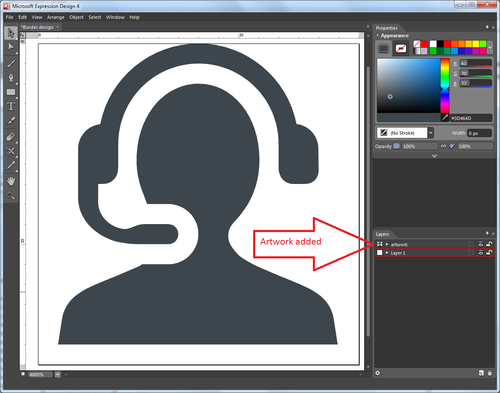
- Drag and drop your Adobe Illustrator graphic image into Expression Design 4 artboard. Your image appears as a Layer in the Layers view.
- In the Layers view, expand each layer of the Layers' list to display the objects available for each of them.
- In the Layers view, select the Border object and drag and drop it into your image's layer.
- Navigate to the Object > Path Operations menu and apply the Unite Command. If the image is not altered (except in terms of colors), you can go to step 7 to export the image. ImportantThe Unite command turns multicolored images into single-colored images.
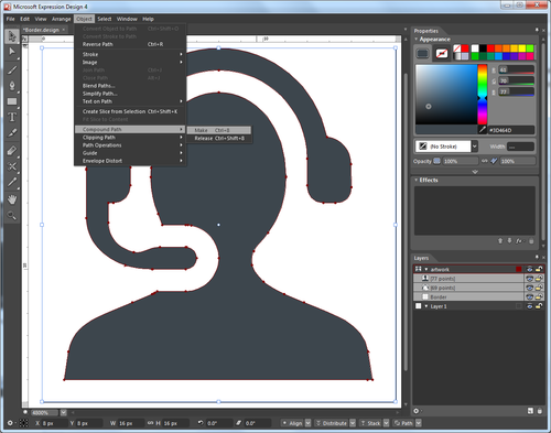
- If the Unite command altered your image, undo it and try the Make Compound Path command on the objects' selection. Navigate to Object > Compound Path > Make. ImportantIf the image is altered by the Make Compound Path command, the image cannot be converted to XAML Path. Ask the image's provider to recreate the image by using a single path.
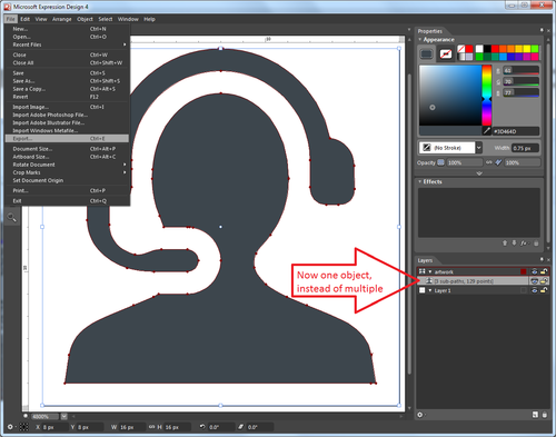
- If your image is not altered and includes only one object in its layer, proceed to the Export dialog.
- Navigate to the File menu. Select Export...
- In the Export Properties section of the Export dialog box, set the format to XAML WPF Resource Dictionary.
- Enter a filename for your destination XAML DrawingBrush, browse a Location, and click Export All.
Converting .AI Image to XAML Path
- Follow steps 1 to 6 of the previous section.
- Navigate to the File menu. Select Export...
- In the Export Properties section of the Export dialog box, set the format to XAML Path.
- Enter a filename for your destination XAML library, browse a Location, and click Export All.
- Open the resulting XAML library and copy the path data available in the Geometry attribute of the GeometryDrawing item from the sample below into your code.
<?xml version="1.0" encoding="utf-8"?>
<ResourceDictionary xmlns="http://schemas.microsoft.com/winfx/2006/xaml/presentation"
xmlns:x="http://schemas.microsoft.com/winfx/2006/xaml">
  <DrawingBrush x:Key="artwork" Stretch="Uniform">
  <DrawingBrush.Drawing>
  <DrawingGroup>
  <DrawingGroup.Children>
  <GeometryDrawing Brush="#FF3D464D" Geometry="F1 M 12.4147,15.7534L 15.488,18.66L 0.821333,18.66L 3.89467,15.7534L 3.896,15.7534C 5.19333,16.46 6.62667,16.9507 8.15333,16.9507L 8.15467,17.048L 8.156,16.9507C 9.68267,16.9507 11.116,16.46 12.3733,15.7747L 12.4147,15.7534 Z M 11.6107,6.58936L 11.3693,6.12006L 6.22933,11.2614C 6.792,11.6 7.44933,11.7987 8.15467,11.7987C 9.70933,11.7987 11.0413,10.8547 11.6107,9.50806C 11.8013,9.06006 11.9053 Z "/>
  </DrawingGroup.Children>
  </DrawingGroup>
  </DrawingBrush.Drawing>
  </DrawingBrush>
</ResourceDictionary>


